Color doesn’t just sit on a wall. It breathes. It shifts with the light, hums in the background, and nudges your mood before you’ve even set down your keys. In interior design, color is the first thing we register—a primal, wordless signal that tells us whether a room feels like a sanctuary or a space we want to leave. Understanding the psychology of color isn’t about following trends. It’s about learning to listen to what a hue does to your pulse, your focus, your sense of peace.
Color psychology draws on environmental psychology, neuroaesthetics, and the quiet tug of personal memory. But in the home, it becomes something much simpler: a way to shape how you feel in your own rooms. A shade that wraps you in calm might leave someone else feeling adrift. The real work isn’t memorizing what each color “means.” It’s paying attention to your own breath when you walk through the door.
The Emotional Weight of Warm and Cool Tones
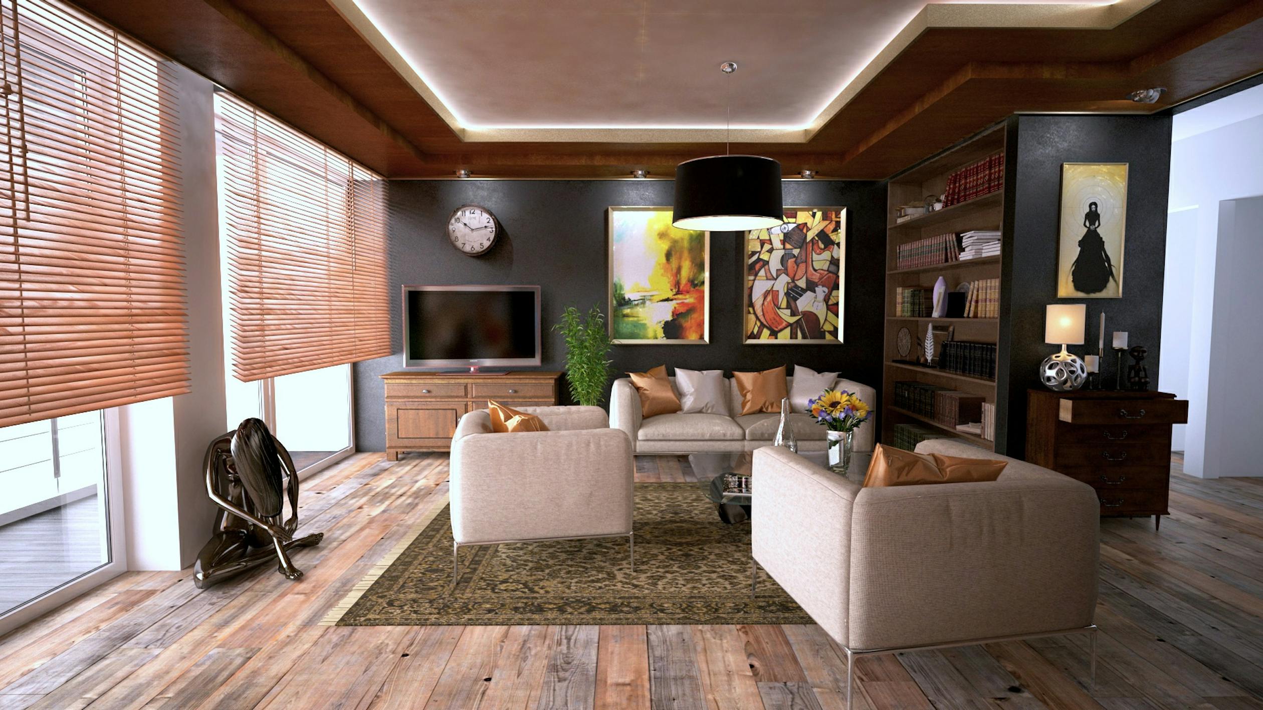
We often talk about warm and cool colors as if they’re fixed categories, but the truth is more fluid. A warm terracotta can feel grounding and earthy, while a bright tangerine might jangle your nerves. A pale, silvery blue can open up a room like a window to the sky, but a deep navy might wrap you in a quiet, almost melancholic stillness. The difference lies in saturation and brightness—how much gray or white lives inside the hue.
Warm tones—ochre, clay, muted coral—tend to draw us in. They’re the colors of firelight and sunbaked earth, and they can make a large, drafty room feel like a cozy nook. Cool tones—sage, slate, watery blue—create distance. They’re the colors of mist and shadow, and they can give a cramped room room to breathe. But these are starting points, not rules. A dusty rose can feel as serene as a pale blue, and a deep forest green can be as enveloping as a warm brown. The emotional temperature of a color is always a conversation between the hue, its intensity, and the light it lives in.
How Light and Space Transform Color Perception
No color stands alone. The same paint chip can look like a soft cream in morning light and a flat, grayish beige by afternoon. Natural light is a shapeshifter—cool and steady from a north-facing window, warm and languid from the west. A room that faces north, with its consistent but chilly light, can drain the warmth from even a carefully chosen neutral. In those spaces, a color with a gentle warm undertone can bring back a sense of balance, like adding a quiet hum beneath the silence.
Artificial light has its own personality. A warm bulb (around 2700K) coaxes out the reds and yellows in a paint, while a cooler bulb (4000K and above) sharpens blues and greens. This is why testing a color on a few walls—and living with it through morning coffee, afternoon glare, and evening lamplight—isn’t just practical. It’s essential. The psychology of color isn’t just about the hue you choose. It’s about how that hue wakes up and goes to sleep in your particular home.
Building a Cohesive Emotional Palette Room by Room
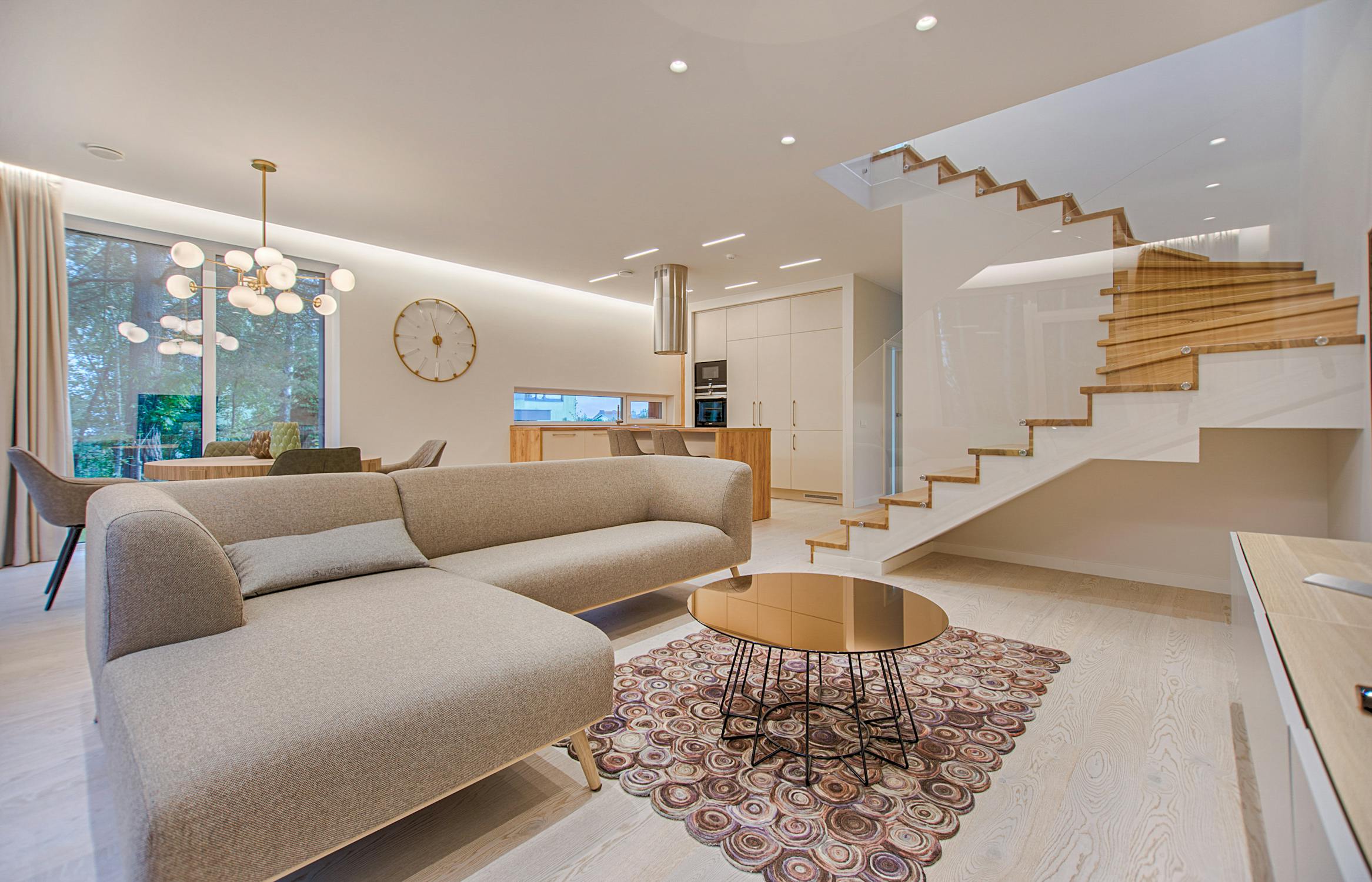
Think of each room as having its own emotional job, and color as the quiet assistant that helps it get the work done. A bedroom’s job is rest and intimacy. Colors that slow the heart and soften the edges—muted blues, gentle greens, a lavender that’s more gray than purple—can reinforce that purpose. A home office, on the other hand, might need a color that steadies the mind without demanding attention. A subdued sage or a warm, earthy clay can ground you while you work, like a steady hand on your shoulder.
In the rooms where we gather—kitchens, living rooms—the emotional goal is often connection. Here, warmer neutrals can do the heavy lifting. Linen whites, soft taupes, a muted ochre that catches the light. These colors create a backdrop that invites people in without shouting for attention. The real magic happens when the palette flows from room to room, with small shifts in tone and temperature that feel like a quiet conversation rather than a series of disconnected statements. A home that breathes together feels whole.
The Restorative Power of Green
Green holds a special place in our minds because it’s the color of the natural world. Research in environmental psychology points to the biophilia effect—the idea that we’re wired to find calm in green landscapes. Bringing that color inside, whether through paint, textiles, or a cluster of plants, can echo that sense of restoration. Soft sage and muted olive are particularly good at this. They’re quiet, grounded, and they pair effortlessly with wood, stone, and linen. A green room doesn’t demand anything from you. It just lets you exhale.
The Depth of Blue: From Serenity to Melancholy
Blue is often called the world’s favorite color, and its effects on the body are well-documented. Lighter blues can slow your breathing and lower your blood pressure, which makes them a natural choice for bedrooms and spaces meant for stillness. Deeper blues—indigo, navy—create a sense of depth and introspection, perfect for a reading corner or a study. But blue has a cool emotional temperature, and in a room starved of natural light, it can tip into sadness. The antidote is texture: warm wood, brass, a thick wool throw. A blue with a bit of complexity—a hint of green or a touch of gray—feels alive rather than flat.
The Quiet Drama of Neutrals
Neutrals are often mistaken for a lack of color, but they’re actually the most subtle part of a designer’s toolkit. A warm ivory, a cool gray, a chalky beige—each carries its own emotional weight. Neutrals create room for the eye to rest and the mind to wander. They let the grain of a wooden table or the weave of a linen curtain come forward. The art of using neutrals is in the layering: combining different tones and materials to build depth without visual noise. A room wrapped in warm plaster tones, with rough-hewn wood and soft linen, can feel as emotionally rich as any boldly painted space.
Practical Ways to Experiment with Color at Home
If the thought of committing to a wall color makes you hesitate, start smaller. Textiles are forgiving—cushions, throws, a rug can test how a color feels in a room without any long-term promises. Art is another gentle entry point. A painting or print can anchor a room’s emotional tone and give you a palette to pull from. Even a ceramic vase or a stack of books can introduce a hue that shifts the mood of a corner.
Another approach is to use color in places that surprise you. A painted ceiling, for instance, can change the whole feel of a room. A soft, pale blue overhead can mimic the sky and make a room feel taller. A warm, earthy tone on the ceiling can bring a lofty space down to a more human scale. The inside of a bookshelf or a small alcove is another opportunity—a flash of color that feels like a secret, a small discovery that makes the home feel more yours.
Cultural and Personal Associations with Color
Some responses to color seem universal—blue’s calm, red’s alertness—but much of what we feel is learned. Culture, memory, and even the current zeitgeist shape our relationship with a hue. In some traditions, white signals purity and new beginnings; in others, it’s the color of mourning. A particular shade of yellow might pull you back to a childhood kitchen, carrying a wave of nostalgia with it. This is why color psychology in the home is so personal. The question isn’t “What does this color mean?” but “How does this color make me feel?”
That personal connection is what makes choosing colors for your home such an intimate process. It asks for a kind of spatial self-awareness—a willingness to sit still and notice your own emotional responses. Over time, you might find yourself drawn to the same palettes again and again, not because they’re fashionable, but because they resonate with something deeper. This is the quiet work of building a home that reflects who you are, not just what you like.
Color and the Passage of Time
Color ages with us, and with the seasons. A room that feels perfect in the bright, hopeful light of summer might feel stark or draining in the gray depths of winter. The way color shifts with the seasons is a reminder that our homes are living environments, changing with the light and with our own inner weather. Some designers suggest a cyclical approach—using textiles and accessories to shift a room’s color temperature from cool to warm as the year turns. A linen slipcover in a pale, cool tone for summer can be swapped for a deeper, warmer hue in winter. This kind of seasonal awareness keeps a home feeling responsive and alive, rather than frozen in a single moment.
Creating a Personal Color Philosophy
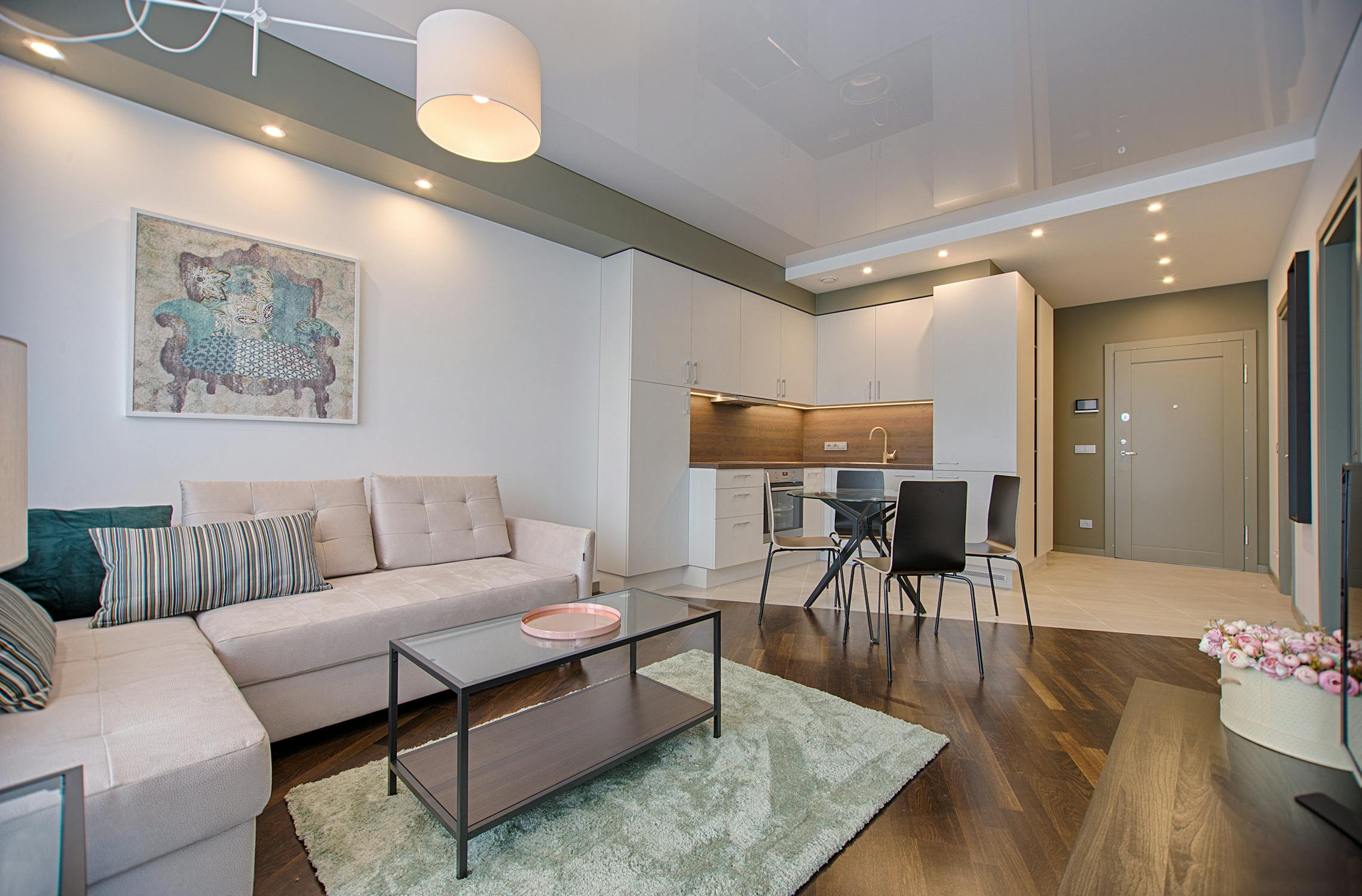
In the end, the psychology of color in interior design isn’t about finding the “right” color. It’s about developing your own color philosophy—one built on observation, experimentation, and a willingness to trust your gut. Maybe your palette reflects the landscape outside your window, or the colors of a place you love. Maybe you use color sparingly, as a form of quiet punctuation, or you embrace it fully as a daily source of energy and joy. The goal isn’t to follow a set of rules. It’s to create a home that feels like an extension of your inner world—a space where the colors you live with support the life you want to live.
As you move through your home, pay attention to the colors that surround you. Notice which rooms make you feel at ease and which ones leave you unsettled. Small shifts—a new cushion, a different lampshade, a repainted alcove—can have a profound effect on your daily experience. The psychology of color isn’t an abstract theory. It’s a practical, deeply human tool for shaping the spaces where we rest, work, and connect. In the end, the most important voice in the conversation is your own.
Frequently Asked Questions
What is the most calming color for a bedroom?
Soft, muted blues and greens are widely considered the most calming colors for a bedroom because of their link to nature and their ability to lower heart rate and blood pressure. That said, a desaturated lavender or a warm, dusty pink can also create a restful atmosphere. The real secret is low saturation—avoiding bright, stimulating hues. Testing a color on your walls and observing how it feels at different times of day is the best way to know if it works for your space.
How do I choose a color palette that flows throughout my home?
Start by picking a core neutral that will serve as the foundation for your main living areas—a warm off-white, a soft greige, or a muted earth tone. Then, choose one or two accent colors that appear in varying intensities across different rooms. For example, a soft green might be a wall color in the bedroom, appear as a textile in the living room, and show up in a piece of art in the hallway. This creates a sense of connection without being repetitive. Pay attention to sightlines between rooms and how colors will relate to each other when viewed from a doorway.
Can color really affect my mood, or is that just a myth?
Color can have a measurable effect on mood and physiology, though the response is often individual and shaped by personal and cultural associations. Research in environmental psychology has shown that certain colors can influence heart rate, blood pressure, and even appetite. For example, exposure to red has been found to increase alertness and even raise blood pressure in some studies, while blue and green environments tend to promote relaxation. But the intensity and context of the color matter greatly. A soft, warm red may feel cozy rather than stimulating. The effect is real, but it’s personal and layered.
How do I use color in a small room to make it feel larger?
Lighter, cooler colors tend to recede visually, making walls feel farther away and a room feel more spacious. Soft blues, pale greens, and light grays are classic choices for expanding a small room. However, painting a small room in a dark, saturated color can also work by blurring the boundaries of the space and creating a cozy, enveloping feel. Using a monochromatic color scheme—where walls, trim, and even the ceiling are painted in varying shades of the same hue—can also make a room feel larger by reducing visual contrast. The direction of natural light and the function of the room should guide your choice.
How do I balance warm and cool tones in a room?
Balance comes from understanding the emotional temperature you want to create and then layering colors accordingly. If you have a room with cool, north-facing light, you might choose a warm neutral for the walls to offset the chill, then bring in cool accents through textiles or art to create depth. In a room with abundant warm light, you might use a cooler wall color to create a sense of freshness, then add warmth through wood furniture, brass fixtures, or textured throws. The goal isn’t a perfect 50/50 split, but a considered interplay that feels harmonious and intentional.