Color is not decoration. It is a quiet form of communication between a room and the person who lives in it. In spatial psychology, color is understood as one of the most immediate sensory cues our brains use to read an environment. It sits alongside light, sound, texture, and scent as part of the sensory envelope of a home. When we speak of the psychology of color in interior design, we are really speaking about how hue, saturation, and brightness shape our nervous system, our sense of safety, and our capacity to rest or focus. This matters deeply in domestic wellbeing design, where the goal is not a perfect room but a room that supports a particular kind of life.
In Scandinavian philosophy, the home is not a stage. It is a shelter for everyday rituals: the first cup of coffee, the slow folding of laundry, the half-hour of reading before sleep. Color can either support those rituals or quietly interrupt them. The evidence is not dramatic, but it is consistent. Studies in environmental psychology have long suggested that color influences mood, perceived temperature, and even the way we estimate the size of a room. What follows is not a list of rules. It is a set of possibilities, grounded in research and in the lived experience of rooms that feel like they are breathing with you.
How Color Works on the Nervous System
Before choosing a wall color, it helps to understand what color does to the body. Color is light at different wavelengths. Our eyes translate those wavelengths into signals that travel not only to the visual cortex but also to the hypothalamus, the part of the brain that regulates arousal, hormones, and the autonomic nervous system. This is why a saturated red room can raise heart rate slightly, while a soft blue room can lower it. The effect is not enormous, but it is measurable. A 2014 review in the journal Frontiers in Psychology noted that color can influence both physiological and emotional responses, though individual and cultural differences matter as much as the hue itself.
In a domestic setting, this means color is not a background. It is an active participant in how a room feels at 7 a.m. and again at 10 p.m. A bright yellow kitchen may feel cheerful in the morning and overstimulating at night. A deep green bedroom may feel cocooning in winter and heavy in summer. The psychology of color is not about finding the “right” color. It is about understanding the relationship between a color, a room’s light, and the rituals that happen there.
Hue, Saturation, and Brightness: The Three Quiet Variables
Most conversations about color begin and end with hue: red, blue, green, yellow. But saturation and brightness often matter more for psychological effect. Saturation is the intensity or purity of a color. A highly saturated orange is vivid and demanding. The same orange with gray added becomes terracotta, which is warmer and more restful. Brightness refers to how much light a color reflects. A pale lavender reflects more light than a deep aubergine, even though they share the same hue family.
In spatial psychology, low-saturation, medium-brightness colors tend to create what researchers call “restorative environments.” These are spaces that allow directed attention to recover. They do not shout. They do not disappear entirely. They hold the room in a kind of gentle equilibrium. This is one reason Scandinavian interiors often favor muted blues, soft grays, and chalky greens. The colors are not chosen for fashion alone. They are chosen because they allow the eye to rest and the mind to settle.
Color and the Sense of Space
Color changes our perception of a room’s size, height, and temperature. This is not an illusion. It is a perceptual shift. Light colors reflect more light, which makes walls appear to recede. Dark colors absorb light, which makes walls feel closer. A small room painted in a soft, cool white can feel larger than it is. The same room painted in a deep charcoal can feel intimate, even cave-like. Neither is better. They serve different needs.
In Nordic homes, where winter light is low and brief, pale colors are often used to amplify whatever daylight exists. A white wall in a Copenhagen apartment is not a blank canvas. It is a light-gathering surface. In a sun-drenched room, however, a pale wall can feel washed out and sterile. A muted clay or sage green can bring the room back to human scale. The psychology of color is always contextual. It depends on the room’s orientation, the quality of light, and the emotional temperature the inhabitant needs.
Warm and Cool Colors: A Question of Temperature, Not Trend
Warm colors—reds, oranges, yellows—tend to advance. They make walls feel closer and rooms feel cozier. Cool colors—blues, greens, violets—tend to recede. They make walls feel farther away and rooms feel more open. This is why a long, narrow hallway painted in a warm terracotta can feel shorter and more welcoming, while the same hallway in a cool gray can feel endless.
But temperature is also emotional. Warm colors are associated with social energy, appetite, and conversation. Cool colors are associated with calm, focus, and introspection. A dining room in a soft ochre may encourage longer meals. A home office in a muted blue may support sustained attention. The choice is not about personality. It is about the kind of activity the room is meant to hold.
Color in the Rooms Where Life Happens
Every room has a rhythm. The kitchen has a morning rhythm of boiling water and slicing bread. The bedroom has an evening rhythm of dimming light and slowing breath. Color can either match that rhythm or work against it. The following suggestions are not prescriptions. They are observations from spatial psychology and from years of sitting in rooms and noticing how they feel.
The Bedroom: A Palette for Letting Go
The bedroom is a room for release. It is where the nervous system is asked to move from alertness to rest. Colors that support this transition are typically low in saturation and moderate in brightness. Soft blues, muted greens, warm grays, and dusty lavenders are common choices. They do not demand attention. They allow the eye to drift.
One useful practice is to look at the bedroom wall color in the evening, under the light you actually use before sleep. A color that feels calm in daylight can feel cold or flat under a warm bedside lamp. If repainting is not possible, consider the color of textiles: a duvet cover, a curtain, a wool throw. These are non-renovation interventions that can shift the room’s emotional temperature without a single drop of paint.
The Kitchen: A Palette for Morning and Evening
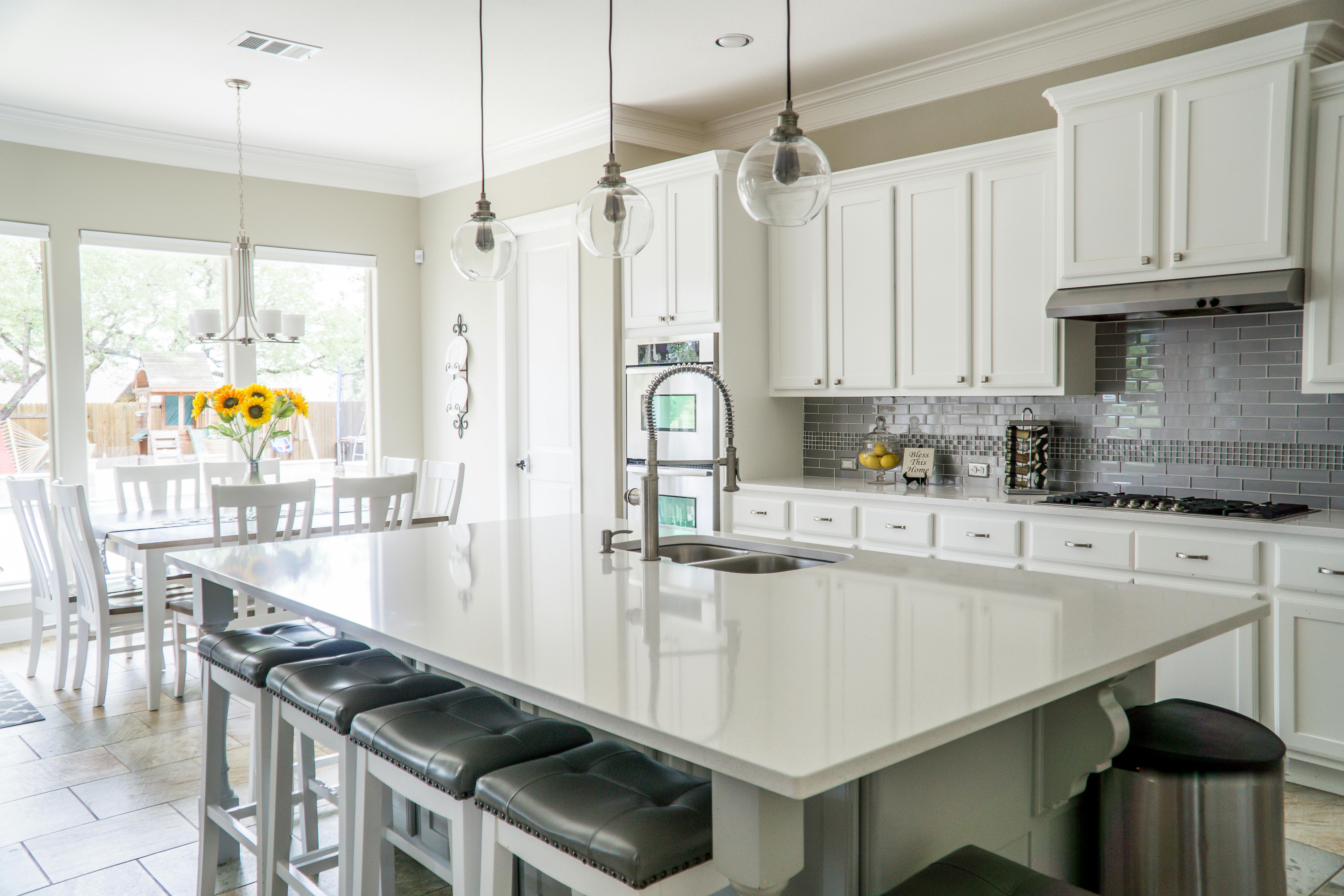
The kitchen is a room of transitions. It is bright and busy in the morning, quieter in the evening. Color here often works best when it is warm but not saturated. Soft yellows, warm whites, pale woods, and muted greens can support both the energy of breakfast and the calm of a late cup of tea. A highly saturated red kitchen can be exciting, but it may also raise the room’s arousal level in ways that feel tiring over time.
In Scandinavian kitchens, color often comes from natural materials: pale birch, gray stone, linen curtains. The walls are frequently white or a very soft gray. This is not austerity. It is a way of letting the food, the light, and the people be the most vivid things in the room.
The Living Room: A Palette for Conversation and Quiet
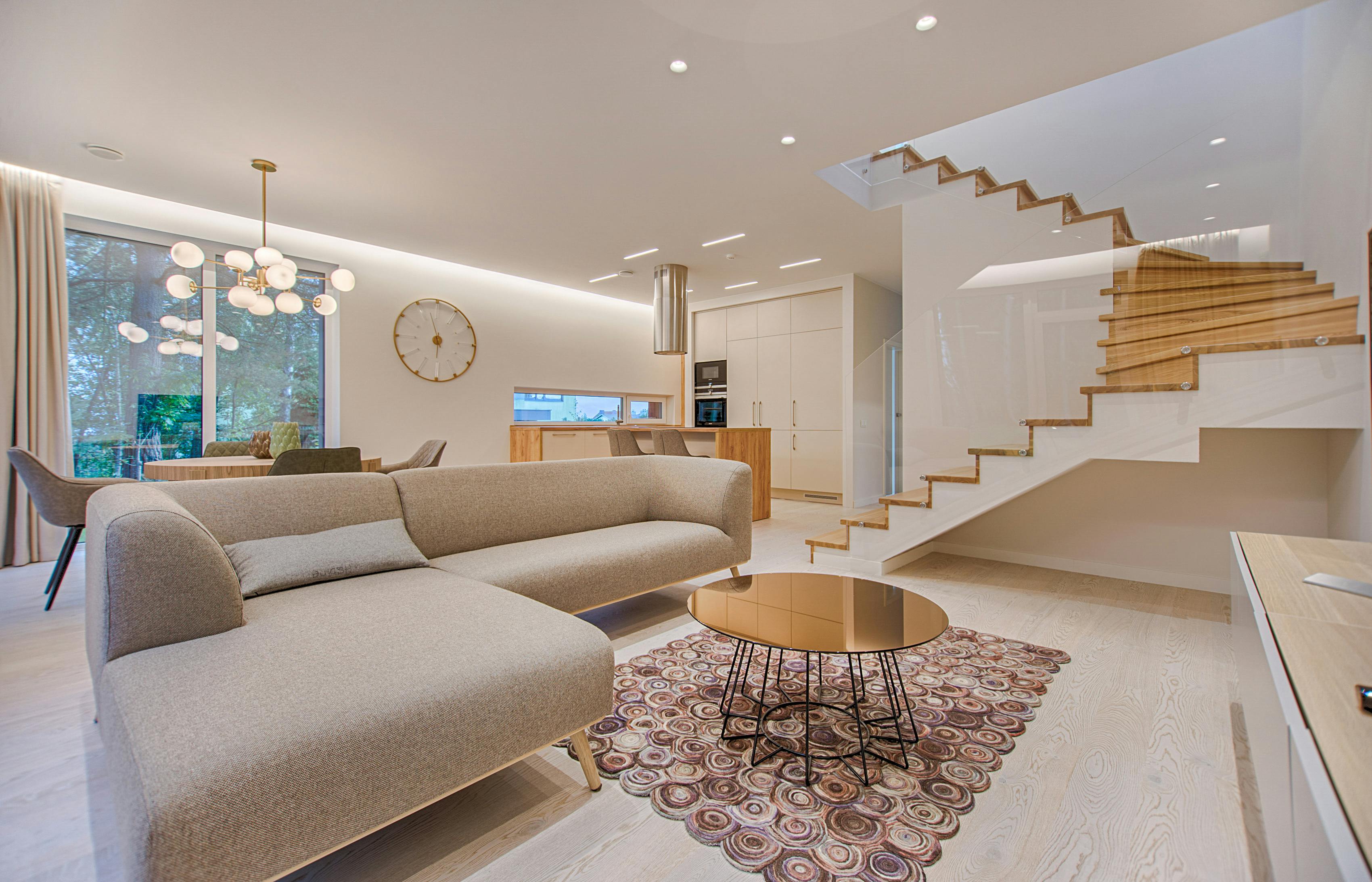
The living room is a room of dual purpose. It is where we talk and where we retreat. A single color rarely serves both needs equally. One approach is to use a neutral base—warm white, soft beige, pale gray—and then introduce color through objects that can be changed with the seasons: a rust-colored cushion in autumn, a pale blue throw in spring. This is a form of color psychology that is flexible and forgiving.
Another approach is to paint one wall in a deeper tone, creating a focal point that anchors the room without overwhelming it. A deep blue-green wall behind a sofa can make the seating area feel more intimate, while the remaining walls stay light and open. The effect is subtle, but it changes how the room holds conversation.
Color, Culture, and Memory
Color is never purely biological. It is also cultural and personal. A particular shade of yellow may remind one person of a grandmother’s kitchen and another person of a hospital corridor. The psychology of color in interior design must always make room for memory. This is why color consultations that rely only on universal meanings—blue is calm, red is energetic—often miss the point. The most important question is not “What does this color mean?” but “What does this color mean to you?”
In the anthropology of everyday rituals, color is part of the sensory texture of home. It is the green of a front door, the blue of a childhood bedroom, the white of a summer tablecloth. These associations are not trivial. They are the raw material of domestic wellbeing. A room that honors them feels more like a home than a room that follows a trend.
Non-Renovation Ways to Work with Color
Not every home allows for repainting. Rental agreements, budgets, and time constraints are real. But color psychology does not require a paintbrush. It can be practiced through textiles, art, plants, and light. A large piece of fabric hung on a wall can change the room’s color temperature as effectively as paint. A linen tablecloth in a soft blue can cool a warm kitchen. A wool blanket in a deep ochre can warm a gray living room.
Plants are another quiet color intervention. Green is the most restful color for the human eye, and living green changes with the seasons. A single potted fern on a windowsill can shift the emotional register of a room more than a new sofa. The key is to notice what the room already holds and to make small, reversible changes that support the life that happens there.
Light as a Color
Light is color. A room painted in the same shade of white will look different at dawn, noon, and dusk. In northern latitudes, the light is often blue and low in winter, which makes warm wall colors feel more necessary. In summer, the same room may feel too warm and benefit from cooler textiles. One of the most effective non-renovation interventions is simply to change the color temperature of your light bulbs. A bulb labeled 2700K gives a warm, candle-like light. A bulb labeled 4000K gives a cooler, more neutral light. The same room can feel like two different rooms under these two lights.

What the Research Says, and What It Does Not Say
The research on color psychology is real but modest. A frequently cited study by Ou et al. (2004) found that color preferences are strongly influenced by context and that “color-emotion” associations vary across cultures. Another line of research in environmental psychology has shown that green spaces, including indoor plants, can reduce stress and improve mood. But the evidence does not support the idea that a single color will reliably produce a single emotion in every person. The effect of color is real, but it is filtered through memory, culture, and the specific light of a specific room.
This is why the most useful approach to color psychology is observational. Spend time in the room. Notice how the color changes across the day. Notice how you feel when you enter. Notice what you reach for when you want to rest. The room will tell you more than any chart.
A Quiet Method for Choosing Color
If you are considering a color change, there is a slow, low-risk way to begin. Choose a small area: a single wall, a window frame, a piece of furniture. Paint a large sample board and lean it against the wall. Live with it for a week. Look at it in the morning and at night. Look at it on a rainy day and a sunny day. Notice whether the room feels more like itself or less. This is not a scientific method, but it is a domestic one. It honors the fact that color is not chosen in a store. It is chosen in the room, over time, in the presence of the life that will live with it.
In the end, the psychology of color in interior design is not about finding the perfect shade. It is about paying attention. It is about treating color as a quiet collaborator in the daily work of feeling at home. The rooms that support us best are rarely the ones that impress us most. They are the ones that meet us where we are, in the soft light of an ordinary morning, and ask nothing in return.
Frequently Asked Questions
What is the most calming color for a bedroom?
Soft, low-saturation blues and greens are often experienced as calming because they are associated with nature and with lower physiological arousal. However, the most calming color is the one that feels restful to you. A muted lavender or a warm gray can be just as effective. The key is to choose a color with moderate brightness and low saturation, and to test it under your evening lighting before committing.
Can color really change how a room feels, or is it just personal preference?
Both are true. Color can influence perceived temperature, spatial perception, and mood, but the effect is always filtered through personal and cultural associations. A color that feels warm and welcoming to one person may feel heavy or nostalgic to another. The most reliable approach is to combine general principles from environmental psychology with your own observation of the room over time.
How can I use color psychology without repainting my walls?
Textiles, art, plants, and lighting are all effective non-renovation tools. A large wall hanging, a change of cushion covers, a new tablecloth, or a shift in light bulb color temperature can alter the emotional register of a room. These changes are reversible, which makes them ideal for renters or for anyone who wants to experiment slowly.
Does color psychology work the same way in every culture?
No. Color associations vary significantly across cultures and personal histories. White, for example, is associated with purity in some cultures and with mourning in others. The biological effects of light and saturation are more universal, but the emotional meaning of a specific hue is always shaped by context. A thoughtful approach to color psychology always includes the inhabitant’s own memories and cultural background.
Further Reading on Spaces3
This article is part of a series on the sensory elements of domestic wellbeing. Future pieces will explore the psychology of natural and artificial light, the role of texture in emotional comfort, and the quiet power of scent in everyday rituals. If you have a room that feels unsettled, consider beginning with a single color observation: sit in the room for ten minutes and write down the first three colors you notice. That list is often the beginning of a more restful home.