The Quiet Language of Walls: How Color Shapes the Spaces We Inhabit

There is a moment, just before you open your eyes in the morning, when the room speaks to you. Not in words, but in a wash of light filtered through the curtains, in the soft weight of the air, in the first blur of tone that meets your waking gaze. That tone—whether it is a pale lavender, a deep charcoal, or a warm, buttery cream—sets the rhythm for the hours ahead. We often think of color as decoration, a surface decision made between swatches and samples. But in truth, it is a psychological force, a silent architect of mood, memory, and movement. I have spent years observing how the walls we build around ourselves become the containers of our inner lives. This is not a guide to trends; it is an invitation to listen to what your rooms are already saying.

Color is not merely seen. It is felt. It seeps into the body through the eyes and settles somewhere deeper—in the pulse, in the breath, in the quiet hum of the nervous system. A room painted in a saturated crimson does not simply look red; it quickens something. A space washed in a muted sage does not just appear green; it slows the heartbeat, softens the edges of thought. This is not metaphor. It is physiology. The wavelengths of light that bounce off a painted wall enter the retina and trigger a cascade of hormonal and neurological responses. The pineal gland, that tiny sentinel deep in the brain, adjusts its melatonin output based on the spectrum of light it receives. A room drenched in cool blue light can, quite literally, keep you more alert. A bedroom steeped in warm, dim tones can coax the body toward rest. The walls are not passive. They are participants in your daily becoming.

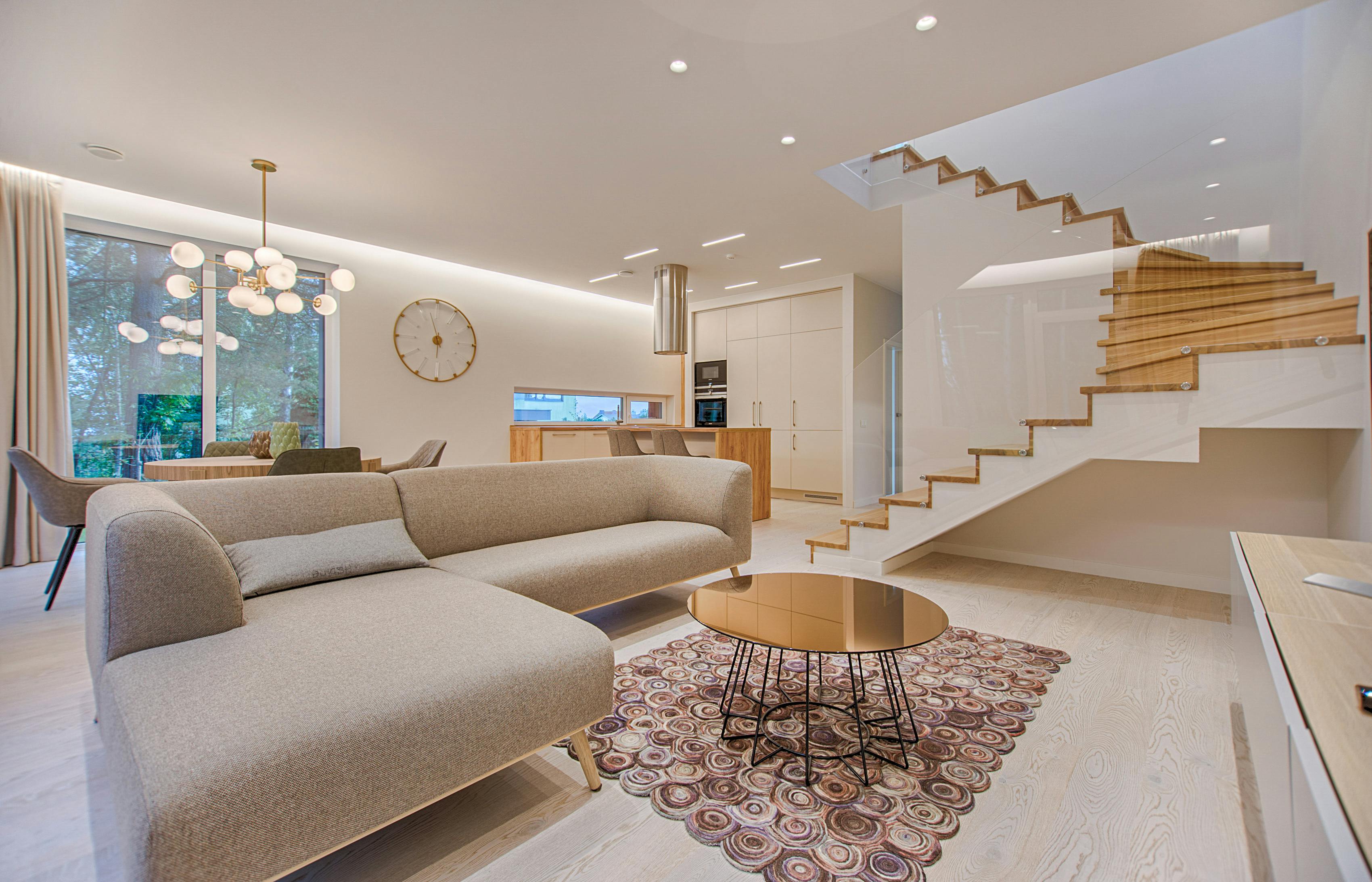
A sunlit living room with soft beige walls and warm wooden furniture, creating a calm and inviting atmosphere.

The Memory of Pigment: How Color Anchors Experience

Walk into a room you have not entered in years, and before you register the furniture or the photographs on the shelf, the color will find you. It will pull you back to a specific afternoon, a particular winter, a conversation held in that very corner. Color is the most tenacious thread in the fabric of memory. A study from the University of British Columbia found that color enhances memory performance for natural scenes, but the phenomenon extends far beyond the laboratory. The ochre of a childhood kitchen, the dusty rose of a grandmother’s hallway—these hues become emotional landmarks. They are not just remembered; they are re-lived.

When we choose a color for our own spaces, we are not simply picking a preference. We are laying down the emotional groundwork for the memories that will form there. A dining room painted in a deep, earthy terracotta will host conversations that feel grounded, nourished, rooted. That same room in a stark white might produce gatherings that feel more cerebral, more fleeting. Neither is better. But they are different. The question is not “What color is in style?” but “What color will hold the memories I want to make here?”

Consider the kitchen. It is the room where mornings are born, where the first coffee meets the first light, where children spill cereal and secrets. A soft, warm yellow—not the aggressive yellow of caution signs, but the gentle yellow of winter sun on a wooden floor—can make those mornings feel like a continuous embrace. It is a color that whispers, “Stay a little longer.” In contrast, a cool, clean white with blue undertones might make the same space feel efficient, crisp, a place for quick nourishment before the day pulls you away. The color does not change the activities, but it changes the emotional residue they leave behind.

The Body in the Room: Spatial Perception and Color

Color does not just affect mood; it alters our perception of space itself. A room is not a fixed container. It expands and contracts, rises and falls, depending on the wavelengths that coat its surfaces. This is not illusion. It is a genuine shift in how the brain maps the environment. Light colors reflect more light, making surfaces appear to recede. Dark colors absorb light, pulling walls inward, creating a sense of enclosure and intimacy. A long, narrow hallway painted in a pale, cool tone will feel wider, more breathable. That same hallway in a deep, warm hue will feel like a passage into something secret, something protected.

Ceiling color is often overlooked, yet it is the surface we spend hours staring at while lying in bed or soaking in the bath. A ceiling painted a shade lighter than the walls will lift the room, creating a subtle sense of airiness. A ceiling painted darker than the walls will lower it, cocooning the space. In a bedroom, this can be a gift—a dark, muted plum or a soft charcoal overhead can create a sensation of being held, of being tucked in by the architecture itself. The body relaxes into this enclosure. The nervous system reads it as safety.

There is also the matter of transition. The colors we choose for hallways and stairwells—the connective tissue of a home—mediate the journey between one emotional zone and another. Moving from a lively, social living room into a hushed, monochromatic corridor is not just a physical shift. It is a psychological decompression. The hallway becomes a palate cleanser, a breath between courses. I often advise clients to think of these transitional spaces as the inhale and exhale of the home. They should not shout. They should prepare.

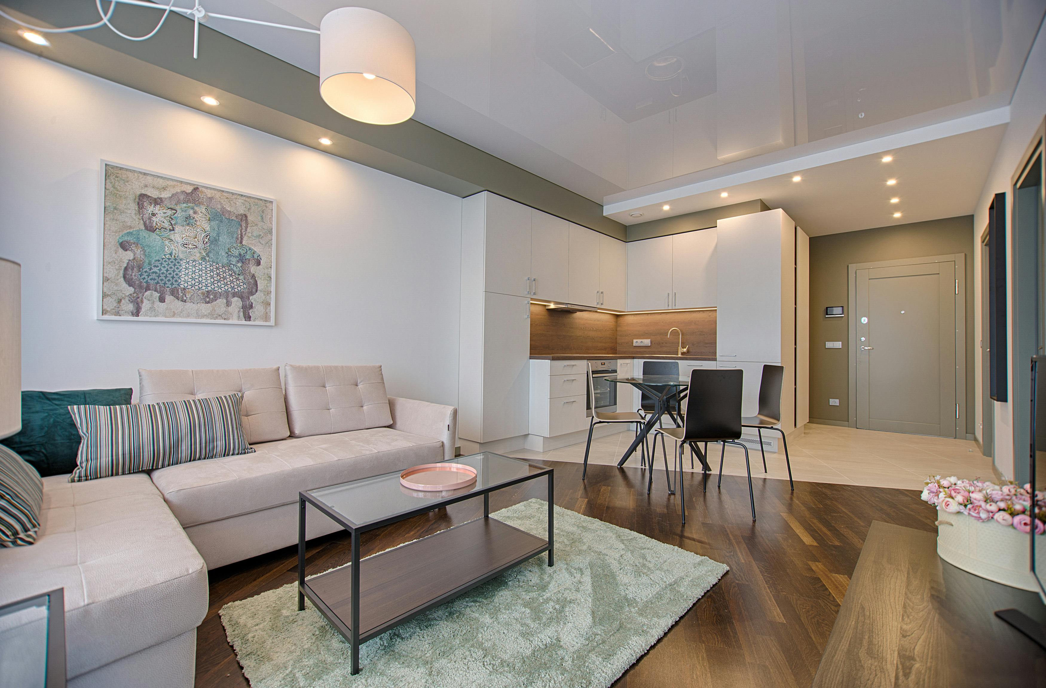
A narrow hallway painted in a soft, pale tone, with natural light streaming from a distant window, creating a sense of openness.

The Spectrum of Self: Color and Identity

We do not just live in color; we are revealed by it. The palette of a home is a kind of autobiography written in pigment. It tells the story of what we need, what we fear, what we long for. Someone who surrounds themselves with deep, saturated jewel tones—emerald, sapphire, amethyst—may be creating a fortress of richness, a space that feels substantial and protected against a world that feels too transient. Someone who lives in a landscape of neutrals—linen, sand, chalk—may be seeking clarity, a visual silence in which to think. Neither choice is accidental, even if it was made without conscious deliberation.

There is a reason we are drawn to certain colors at certain times in our lives. After a period of chaos or grief, people often crave white. Not the sterile white of a hospital, but a soft, layered white with undertones of cream or gray. It is a color of erasure, of starting over. It clears the visual field so the mind can begin to sort through what remains. Conversely, after a long stretch of isolation or monotony, there can be a sudden hunger for color—a bright coral accent wall, a chair upholstered in mustard velvet, a bookshelf painted in deep teal. This is the psyche reaching out, asking to be stimulated, to be reminded of its own aliveness.

Children understand this instinctively. A child will often choose a color for their room that an adult finds overwhelming—a screaming magenta, a neon green. But the child is not decorating; they are self-regulating. They are pulling in the stimulation they need to feel engaged and alive. As we age, our color needs often shift toward the more subdued, not because we lose our capacity for intensity, but because our internal landscapes become more complex. We need the walls to hold space for that complexity, not compete with it.

Light: The Great Collaborator

No color exists in isolation. It is always in conversation with light, and light is a shapeshifter. The same gray that feels like a soft, enveloping fog on a north-facing wall in London can turn cold and unforgiving in the harsh, direct sun of a south-facing room in Lisbon. The color itself has not changed, but its expression has. This is why the practice of choosing color must be site-specific, moment-specific. A paint chip in a store under fluorescent light is a lie. A sample painted on a wall at noon is only one version of the truth. You must live with a color through the arc of a day, through the shift of seasons, to understand what it will actually say to you.

I keep a ritual for this. When considering a new color for a room, I paint a large board—at least a meter square—and move it around the space over the course of a week. I watch it at dawn, at midday, at dusk, under lamplight. I watch it on a rainy Tuesday and a bright Saturday. The color reveals itself slowly, in layers. What seemed warm in the morning might feel muddy by evening. What felt serene on a cloudy day might feel flat when the sun pours in. This patient observation is not indecision; it is respect. It is acknowledging that the wall will be in relationship with light for years, and that relationship deserves to be understood before it is committed to.

Artificial light is another collaborator, one we have more control over. The temperature of a light bulb—measured in Kelvins—can completely transform a color. A warm white bulb (around 2700K) will enhance the golden undertones in a beige, making it feel honeyed and intimate. A cool white bulb (4000K or above) will pull out the blue or green undertones, making the same beige feel more modern, more detached. In a room that serves multiple purposes—a living room that is both a place for evening relaxation and daytime work—consider lighting in zones. Let the color shift with the task, with the hour, with the need.

The Emotional Architecture of Specific Hues

While every color is a universe of variation, certain families carry consistent psychological signatures. Understanding these can be a starting point, a compass rather than a map.

Blue is the color of distance. It is the sky, the sea, the horizon. In interior spaces, it pulls the eye outward, creating a sense of expansiveness even in small rooms. Pale, dusty blues can feel contemplative, almost melancholic in a gentle way—perfect for a study or a reading nook where introspection is welcome. Deeper blues, like indigo or navy, feel authoritative and grounding. They are colors of depth, of night, of the subconscious. A dining room in deep blue can make meals feel like rituals, like gatherings of significance.

Green is the color of equilibrium. It sits at the center of the visible spectrum, and the eye processes it with the least strain. It is the color the brain associates with life, with growth, with the natural world from which we came and to which we are still, in our bodies, tethered. A soft sage or olive in a living room can create a sense of being sheltered by a canopy, of being indoors but not cut off from the living world. Brighter greens—chartreuse, emerald—are more energizing, more like the first shoots of spring. They bring a sense of renewal, of possibility.

Red is the color of the body. It is blood, fire, passion, danger. It raises blood pressure and quickens the pulse. In interior design, it is best used in spaces of high energy and brief duration—a dining room where lively debates happen, a powder room that surprises and delights, an entryway that announces vitality. Too much red in a space of rest can be exhausting. The nervous system cannot fully relax in the presence of such insistent stimulation. But a single red element—a chair, a painting, a vase—can act like a heartbeat in an otherwise quiet room, keeping the space alive.

Yellow is the color of the mind. It is associated with sunlight, with clarity, with intellectual energy. In a workspace or a kitchen, it can sharpen focus and lift spirits. But yellow is also the most fatiguing color to the eye over time, and in large doses it can create anxiety. The key is in the undertone. A yellow with a brown or ochre base feels grounded, earthy, like late afternoon light. A yellow with a green undertone can feel sickly. A pure, bright yellow is best used as an accent, a flash of optimism rather than a constant demand for cheerfulness.

Neutrals are not the absence of color; they are the presence of subtlety. A warm gray with violet undertones can feel elegant and slightly mysterious. A cool gray with blue undertones can feel clean and modern. Beiges and taupes are the colors of earth and stone, of things that have been worn smooth by time. They are the quietest colors, but they are not empty. They hold the light and the shadows in a way that more saturated colors cannot. They are the ideal backdrop for a life that is already full of texture—books, art, textiles, people.

Creating Color Conversations: The Art of Relationship

A single color is a monologue. A palette is a conversation. The way colors relate to each other within a space determines whether that space feels harmonious or discordant, stimulating or soothing. There is a principle in color theory that is less about rules and more about listening: every color changes the color next to it. A gray will look warmer beside a blue than beside a yellow. A white will pick up the undertones of whatever surrounds it. This is why a room that uses only one color can feel flat, while a room that layers related tones can feel rich and alive, even if the differences between those tones are barely perceptible.

Consider the concept of a “whispering palette”—a collection of colors so closely related that they seem to be variations of a single breath. A room painted in three shades of the same gray, with textiles in similar tones but different textures, can feel profoundly peaceful. The eye moves through the space without interruption, without the jarring stop of contrast. This is a palette for meditation, for rest, for spaces where the primary activity is simply being.

At the other end of the spectrum is the “conversation palette”—colors that are distinct but related, like members of a family who share features but not personalities. A living room with walls in a muted teal, upholstery in a dusty coral, and accents in a warm brass can feel dynamic and welcoming. The colors talk to each other, but they do not argue. They create a sense of movement, of life, without chaos.

Then there is the “declaration palette”—a deliberate clash, a moment of high drama. A deep purple wall behind a mustard yellow sofa. A bright orange door in a room of cool grays. These are choices of confidence, of personality. They say, “I know what I am doing, and I am doing it on purpose.” But they require a light touch. Too many declarations, and the room becomes a shouting match. One or two, carefully placed, and the space sings.

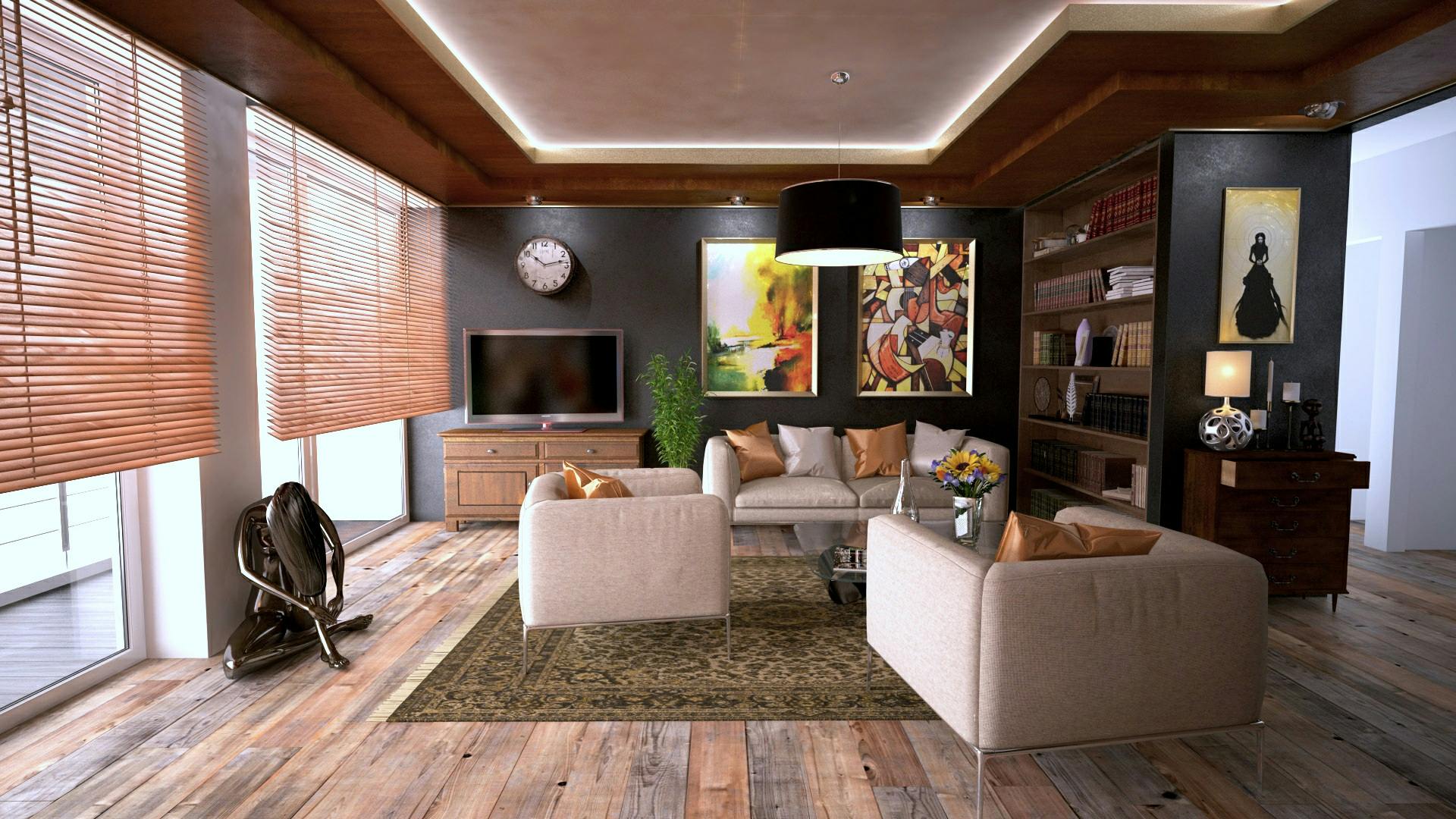
A living room with a deep purple accent wall and a mustard yellow sofa, showcasing a bold and intentional color contrast.

Color as Ritual: The Practice of Living with Hue

Choosing a color is not the end of the process; it is the beginning of a relationship. Over time, the color will change—fading in the sun, gathering the patina of touch, shifting with the dust and the light and the life that moves through it. This is not deterioration. It is deepening. A wall that has held a color for a decade is not the same wall it was when it was first painted. It has absorbed the history of the room. It has become a witness.

I believe in the practice of seasonal color shifts—not repainting entire rooms, but introducing small, temporary changes that respond to the rhythm of the year. In winter, I bring in deeper tones through textiles: a burgundy throw, charcoal cushions, curtains in a heavier, darker fabric. In summer, I strip back to lighter layers: linen in natural tones, cotton in faded blues, the walls allowed to breathe. These shifts are not about redecorating. They are about attunement. They acknowledge that we are cyclical creatures, that our needs change with the light and the temperature, and that our spaces should change with us.

There is also the ritual of noticing. Sit in a room you love and ask yourself: What is the color doing to me right now? Not what it looks like, but what it feels like. Is it holding me? Is it energizing me? Is it asking something of me that I cannot give? This kind of attention is the foundation of a true relationship with space. It transforms color from a design choice into a living presence.

FAQ: Common Questions About Color and Interior Psychology

Can a room’s color really affect my sleep quality?

Yes, and the mechanism is both psychological and physiological. Colors with shorter wavelengths—blues and cool greens—tend to have a calming effect on the nervous system, lowering heart rate and blood pressure. They also signal to the brain an environment similar to twilight or night, which can support the natural production of melatonin. Conversely, colors with longer wavelengths—reds, oranges, bright yellows—are more stimulating and can interfere with the body’s wind-down process. The intensity matters as much as the hue; a muted, dusty blue will be more sleep-supportive than a bright, electric turquoise. The ideal bedroom color is one that feels like a exhale: soft, muted, and warm or cool depending on your personal comfort.

How do I choose a color for a room with very little natural light?

Rooms with limited natural light require a shift in strategy. Rather than fighting the darkness with bright white—which can often look dingy and flat in low light—embrace the inherent coziness. Warm, mid-tone colors with yellow or red undertones can create a sense of enveloping comfort. A soft terracotta, a warm caramel, or a deep, muted gold can make a dim room feel intentional and inviting, like a den or a sanctuary. Avoid cool grays and blues with strong blue undertones, as they can feel cold and unwelcoming without sufficient light to bring them to life. Always test your color on multiple walls and observe it at different times of day before committing.

Is it true that color preferences change as we age?

Color psychology research suggests that preferences do shift over a lifetime, often in predictable patterns. Young children are typically drawn to high-saturation, primary colors because their developing brains seek strong stimulation. As people move into adulthood, preferences often become more complex and refined, with a greater appreciation for muted, sophisticated tones. In later life, there can be a renewed appreciation for brighter colors, partly due to changes in visual perception—the lens of the eye yellows with age, making blues harder to distinguish and warmer tones more appealing. But these are broad trends; individual psychology, culture, and personal history always play a stronger role than age alone.

Can I use bold colors in a small space without it feeling overwhelming?

Absolutely. A small room is an opportunity for intensity, not a limitation. A deep, saturated color in a powder room, a study nook, or a small entryway can create a jewel-box effect—a sense of being enveloped in something precious and complete. The key is to commit fully. A single accent wall in a bold color can feel disjointed in a small space; wrapping the entire room in the hue creates a cohesive, intentional atmosphere. Balance the intensity with plenty of light sources—sconces, lamps, candles—to create depth and shadow. The result is a space that feels expansive in its emotional impact, even if its square footage is modest.

In the end, the psychology of color in interior design is not a set of prescriptions. It is a language. And like any language, it is learned not through memorization but through immersion. Live with color. Watch it. Let it speak to you. The walls are listening, and they are also talking. The question is whether we are quiet enough, patient enough, to hear what they have to say.

When a Room Speaks: The Quiet Psychology of Color in Our Homes

The first time I understood a room could actually speak, I was standing in a friend’s kitchen above a bakery in Copenhagen. The walls were the colour of unbleached linen, the table scrubbed pine, and the single window let in a light so pale it seemed to hold its breath. I felt my shoulders drop. My mind, which had been clattering all morning, grew still. It took me years to name what had happened: that room had spoken in a dialect of colour, and my body had answered before my mind could catch up. Colour is never just decoration. It’s atmosphere, memory, a quiet pulse that shapes how we feel inside a room and, in turn, how we feel about ourselves.

A sunlit living room with pale beige walls and natural wood furniture, embodying a calm, contemplative atmosphere.
A palette of muted neutrals can soften the edges of a busy mind.

The Body Remembers Colour Before the Mind Does

We usually treat colour as an aesthetic choice—something we pick from a fan deck because it pleases the eye. But the eye isn’t the first part of us to receive colour. Light enters through the retina and travels not just to the visual cortex but also to the hypothalamus, that ancient part of the brain that governs our hormonal rhythms, our sleep-wake cycles, our sense of safety or alertness. A deep blue wall doesn’t just look calm; it signals to the body that the environment is one of stillness, much like the sky after dusk. A terra cotta floor echoes the earth underfoot, grounding us in a way that’s more felt than seen.

In my own home, a small apartment on the edge of a fjord, I’ve learned to read this bodily response. The north-facing bedroom was once painted a cool, crystalline white that I thought would feel airy. Instead, it felt thin, almost brittle, especially in winter when the light already carried a blue-white chill. I repainted it a warmer shade—a dusty rose that holds the grey light and softens it into something closer to a wool blanket. The difference wasn’t just visual. I began sleeping more deeply. The room no longer felt like a space I passed through but one that held me.

The Emotional Weight of Hue and Saturation

Not all colours carry the same emotional gravity, and much depends on saturation and context. A highly saturated red, for instance, prods the nervous system—heart rate can rise, appetite can sharpen. That’s why red is so common in restaurants and markets. But a muted red, like the faded ochre of a Tuscan villa wall, speaks an entirely different language. It whispers of age, of sun and stone, of a history that doesn’t need to announce itself. When I bring red into a space, I almost always lean toward these earthy, desaturated versions—colours that seem to have been bleached by time rather than manufactured in a lab.

A quiet corner with a dusty rose armchair against a backdrop of warm, muted wall color and soft daylight.
Dusty rose can transform a chilly northern light into a warm embrace.

Green, too, shifts its emotional tone dramatically depending on its depth. A bright, yellow-green can feel almost jarring—like new shoots in spring that demand attention. A deep forest green, on the other hand, evokes stillness and shelter. I once painted the back wall of a reading nook in a colour called “Dusk Moss,” a green so dark it was nearly black in evening light. Sitting there felt like being inside a tree hollow. The world outside quieted. That’s the gift of green: it reminds us, without words, that we’re still creatures who grew up among leaves.

Blue and the Longing for Distance

Blue is the colour most often named as a favourite, and I suspect it’s because blue has a unique relationship with space. It recedes. It doesn’t press against the eye the way red or orange do. A pale blue ceiling can make a room feel taller, not by optical trick alone but by recalling the dome of the sky. A deep navy wall in a study creates a sense of depth that invites the mind to wander inward. I have a friend, a writer, who painted her entire workspace a dusty indigo. She told me it was the only colour that made her feel as though the walls weren’t closing in during long winter afternoons. She was describing, I think, the way blue gives us room to breathe—a kind of visual solitude.

Yet blue can also tip into coldness if you’re not careful. A room with too much sharp blue can feel emotionally distant, even sterile. I always balance blue with textures that hold warmth—a chunky wool throw, a wooden floor with honeyed undertones, a lamp that casts amber light. Colour never acts alone; it’s in conversation with every surface and source of light in the room.

A bedroom with deep indigo walls and warm amber lighting, creating a cocoon-like, contemplative mood.
Deep indigo walls paired with amber light create a sanctuary for thought.

The Neutral That Isn’t Nothing

There’s a trend, in certain design circles, to treat neutrals as a safe default—the beige box that offends no one. But a neutral palette, chosen with intention, is far from empty. It’s a canvas for light itself. The whites of a room can shift from chalky to creamy to grey depending on the hour, and a wall painted in a warm greige will hold the late afternoon sun like a cupped hand. I think of neutrals as the silence between notes in a piece of music. They allow the objects in a room—a ceramic bowl, a woven basket, a single branch in a glass vase—to become more present. In a world that often shouts, a quiet room can be a profound relief.

My own living room is almost entirely neutral: walls the colour of sand, linen curtains, a jute rug. But I’ve placed a single deep green velvet chair in one corner, and it acts like a punctuation mark. The eye goes to it. The space breathes around it. This is the power of a restrained palette—it teaches us to see what’s already there.

Light as an Ingredient in Colour

No colour exists independently of light, and light is the most overlooked variable in interior design. The same paint colour can look like three different colours depending on the orientation of a room, the time of day, and the climate. A soft grey in a south-facing room in Barcelona will feel warm and luminous. The same grey in a north-facing room in Oslo will retreat into a flat, cold shadow. I keep sample boards in every room and watch them for days before committing to a colour. I move them from wall to wall. I look at them at dawn, at noon, and after dark with only a lamp. The colour I choose is never the one I first imagined. It’s the one that held up under the room’s particular light and continued to feel true.

Artificial light matters just as much. A bulb’s Kelvin rating—the measure of its warmth or coolness—can completely alter a colour’s emotional reading. A warm 2700K bulb will draw out the golden notes in a plaster wall, while a cooler 4000K bulb will emphasise its grey undertones. I treat lamps as collaborators in the colour story of a room, not as afterthoughts.

Colour and the Shape of Time

There’s another dimension to colour that we rarely discuss: its relationship to time. Bright, saturated colours often feel immediate, present-tense. They ask for attention now. Muted, faded colours carry a sense of the past—they feel as though they’ve lived through seasons. This is why a room painted in a soft, washed-out sage can feel so restful. It doesn’t demand anything of the present moment. It seems to say: stay as long as you like; there’s no hurry.

I’ve come to think of my home as a place where time should slow down. The colours I choose aren’t the ones that shout for tomorrow but the ones that sit quietly with today. A faded linen blue, a plaster pink, a clay white—these are colours that know something about endurance. They don’t tire the eye or the spirit. They settle in, and they let us settle, too.

Practical Ways to Listen to a Room’s Colour Needs

When I begin a colour journey with a new space, I don’t start with paint chips. I start with stillness. I sit in the room at different hours and simply notice how I feel. Is the room too sharp in the morning? Does it feel heavy in the afternoon? What kind of quiet does it need? I also pay attention to the colours I’m drawn to in nature—the grey of a certain rock, the underside of a fog bank, the pale green of lichen. These are the colours that already live in my subconscious, and they’re often the ones that will feel most at home indoors.

I also think about the room’s purpose not just functionally but emotionally. A bedroom isn’t just for sleeping; it’s for unravelling the day, for vulnerability, for the slow drift into unconsciousness. It needs colours that don’t pull at the mind. A kitchen, on the other hand, is a place of gathering and nourishment. It can hold more energy—a warm yellow, a terra cotta, even a deep blue that reminds us of the sea. The question is always: what feeling do I want to inhabit in this room?

Frequently Asked Questions

How do I choose a colour palette if I’m afraid of making a mistake?

Start with the colours you already love in your clothing or in nature. These are clues to your emotional comfort zone. Test large paint samples on multiple walls and observe them for several days in different light. Remember that colour can be changed, and a “mistake” often teaches you more about your space than a safe choice ever would. Begin with a neutral foundation and add one or two accent colours through textiles or a single painted wall. This layered approach feels less permanent and allows you to adjust over time.

Can dark colours work in small rooms?

Yes, and they can be transformative. A small room painted in a deep colour doesn’t necessarily feel smaller—it often feels more intimate and defined. The key is to consider the light source and to balance the darkness with warm lighting and textures. A small library or bedroom enveloped in navy or charcoal can become a cocoon, a place of retreat. The colour recedes rather than crowds, and it blurs the corners, making the boundaries of the room less distinct.

How does colour affect mood over time, not just immediately?

Immediate reactions to colour are tied to physiological responses—red can quicken the pulse, green can relax the eyes. But over time, colour shapes our emotional baseline. Living in a space with colours that align with your temperament can reduce a low-level hum of anxiety you may not have even recognised. A room that feels harsh or overstimulating can contribute to mental fatigue, while a room with a harmonious, muted palette can support a quieter, more reflective state of mind. The effect is cumulative, like a piece of music played softly in the background of your days.

What role do personal memories play in colour perception?

Personal memory is one of the strongest influences on how we experience colour. A particular shade of yellow might feel cheerful to one person and unsettling to another because it recalls a childhood kitchen or a hospital waiting room. There’s no universal emotional language for colour, only shared tendencies. When choosing colours for your own space, honour your personal history. If a colour evokes a memory that makes you feel whole, it belongs in your home, even if it defies conventional design advice.

The Quiet Language of Walls: How Color Shapes the Spaces We Inhabit

There is a moment, just before you open your eyes in the morning, when the room speaks to you. Not in words, but in a wash of light filtered through pigment—the soft grey of a foggy dawn, the warm ochre of a sun-drenched wall. Color is the first sensory handshake your home offers each day, and it sets the tone long before your feet touch the floor. We often think of interior color as decoration, a surface decision. But spend enough time in a room painted the wrong shade, and you begin to understand: color is not merely seen. It is felt.

I’ve spent years watching how spaces hold us. In the quiet corners of Scandinavian apartments, in the sun-bleached villas of the Mediterranean, in the deep, moody libraries of old English homes—color acts as an emotional architect. It can expand a wall, lower a ceiling, or wrap a room in a stillness that feels almost physical. This isn’t about trends or color wheels. It’s about the psychology of inhabitation, the way a hue can alter the rhythm of your breath without you ever noticing.

The Body Before the Eye: How We Process Color Physiologically

Before we name a color—before we even consciously register it—our body has already responded. The human eye perceives light wavelengths and translates them into signals that reach the hypothalamus, the part of the brain governing hormones, temperature, and sleep cycles. A room bathed in deep blue light can slow the heart rate. A space saturated with warm reds and oranges can subtly raise blood pressure and stimulate appetite. This is not metaphor; it is neurobiology.

Consider the work of Faber Birren, a pioneer in color psychology who advised industries and hospitals on the physiological effects of hue. Birren found that exposure to red light increased pulse and respiration, while blue light had a calming, even sedative effect. These findings have quietly shaped environments where human states matter most—prison holding cells painted a specific shade of pink to reduce aggression, hospital recovery rooms using soft greens to ease anxiety. Our homes deserve the same intentionality.

When you choose a color for your bedroom, you are not simply picking a preference. You are selecting a frequency that will hum beneath your sleep, your lovemaking, your solitary mornings. A deep, muted blue—like the color of twilight reflected on still water—can signal to the body that it is time to rest. A sharp, citrus yellow in the same space might keep the mind alert long after the lamp is turned off. The wall is never silent.

Soft blue bedroom wall with morning light casting gentle shadows across the bed
A bedroom wall in muted blue absorbs the early light, creating a container for rest.

The Spatial Illusion: How Color Redraws the Room

Color doesn’t just sit on a surface; it alters the perceived dimensions of the space itself. This is one of the quietest and most powerful tools in interior design. Light colors push walls outward. Dark colors pull them in. A long, narrow hallway painted in a deep charcoal can feel like a warm embrace rather than a claustrophobic tunnel, because the darkness blurs the boundaries. A small room washed in pale, cool grey can feel expansive, as if the walls are exhaling.

Ceiling color is often overlooked, yet it defines the psychological weight of a room. A white ceiling floats above you, airy and detached. A ceiling painted the same color as the walls—or a shade darker—creates a cocoon, a sense of being held. In bedrooms, this can deepen intimacy. In dining rooms, it can encourage lingering conversations that stretch late into the evening. The ceiling is the fifth wall, and it carries the sky of your interior world.

There is also the matter of temperature. Warm colors—reds, oranges, yellows—advance toward the eye, making a wall feel closer. Cool colors—blues, greens, soft violets—recede, creating distance. In a room with an awkward architectural feature, a strategic shift in color temperature can redirect attention, making a protruding column disappear or a distant wall feel nearer. The eye follows the warmth.

Emotional Resonance: The Moods We Paint Into Being

Every color carries an emotional lineage, shaped by nature, culture, and personal memory. Green is not just green. It is the damp moss of a forest floor, the first shoots of spring, the sterile green of a hospital corridor. When we bring a color indoors, we bring all its associations with it. The task is to choose the right memory.

Blue is the color of introspection. It is the sea and the sky, both vast and indifferent, yet somehow comforting in their indifference. In interiors, blue works best in spaces of retreat—bedrooms, reading nooks, bathrooms where you soak rather than rush. But beware of cold blues in north-facing rooms; without warm light, they can turn melancholy, even depressive. A blue with a hint of green or grey warms itself, becoming complex and forgiving.

Green sits at the center of the visible spectrum, and perhaps that is why it feels so balanced. The human eye is most sensitive to green wavelengths, a remnant of our evolutionary dependence on verdant landscapes. Green in a room restores attention. It is the color of study walls and therapy offices, of places where focus and calm must coexist. A sage green kitchen can make the act of chopping vegetables feel meditative.

Yellow is the most contentious color in interior design. In its soft, buttery form, it is optimism—a north-facing room’s best friend, capturing whatever light slips through the window and holding it there. But bright, saturated yellow is the most fatiguing color to the human eye. It overstimulates, agitates. Babies cry more in yellow rooms, studies suggest. Use it sparingly, like saffron in a dish, a thread of warmth rather than the whole meal.

Living room with sage green walls and natural wood furniture, soft afternoon light
Sage green walls bring the restorative quality of nature indoors, balancing calm and clarity.

Red is the color of the heart, of blood, of urgency. In a dining room, it can stimulate appetite and conversation—think of the deep crimson walls of a Parisian bistro. In a bedroom, it can disrupt sleep, keeping the nervous system on alert. A little red goes a long way: a terracotta accent wall, a burgundy velvet chair, the spine of a book. Let it punctuate rather than dominate.

Neutrals are not the absence of color but the presence of subtlety. A warm grey carries undertones of brown or pink; a cool grey leans blue or green. The wrong neutral can feel lifeless, institutional. The right one wraps a room in quietude, allowing textures and forms to speak. White, too, is never just white. It is chalk, cream, bone, snow—each with its own temperature and mood. The Scandinavians understand this deeply, layering whites of different warmth to create spaces that feel luminous rather than sterile.

The Memory of Light: How Color Changes Throughout the Day

A color is not a fixed thing. It is a relationship between pigment and light, and light is always moving. The same grey wall that feels cool and reserved at noon can turn velvety and intimate at dusk. A warm terracotta that glows under morning sun might flatten under artificial light. This is why paint chips are deceptive; they show you a color in isolation, under perfect, even lighting that exists nowhere in a real home.

To understand a color, you must live with it. Paint large swatches on multiple walls. Observe them at breakfast, at midnight, on cloudy afternoons. Watch how the color converses with your floor, your furniture, the view outside your window. A color that harmonizes with the landscape—echoing the grey-green of olive trees or the rusty orange of canyon rock—will feel rooted, inevitable. A color that fights its context will always feel like a stranger in the room.

Artificial lighting transforms color even more dramatically. Warm incandescent light (around 2700K) amplifies reds and yellows while muting blues. Cool LED light (4000K and above) sharpens blues and greens but can make warm tones look muddy. The solution is not to avoid one or the other, but to test your colors under the exact bulbs you will use. A bedroom lit only by warm, dimmable lamps can handle a cooler wall color because the light will soften it. A kitchen flooded with cool daylight LEDs needs warmth in the walls to feel welcoming.

Cultural Echoes and Personal Memory

Color psychology is not universal. A white room signifies purity and simplicity in Scandinavian design, but in parts of East Asia, white is the color of mourning. Red means luck and celebration in China, danger and passion in the West. These cultural codes run deep, often below conscious awareness, and they shape how a space feels to its inhabitants. There is no single correct emotional response to a color—only the response it evokes in you, in your context, with your history.

Personal memory is equally powerful. The particular blue of your grandmother’s kitchen, the mustard yellow of a childhood school bus, the dusty pink of a first apartment—these colors carry narratives. When you find yourself inexplicably drawn to a hue, ask yourself where you have met it before. Often, we are trying to recreate a feeling, not a look. A home filled with personally resonant colors becomes a kind of autobiography written in pigment.

Color as Ritual: The Act of Choosing

There is a slowness required here that modern life resists. Choosing a wall color should not be efficient. It should be a process of attunement, a period of listening to the room and to yourself. What do you need from this space? A kitchen might need to wake you up gently, to make the first cup of coffee feel like a small ceremony. A home office might need to hold your concentration without gripping it too tightly. A bedroom might need to dissolve the day’s tensions, to be a threshold between the world and sleep.

Start not with the color fan deck but with the feeling. Close your eyes in the empty room. What temperature do you want on your skin? What emotional weather? Then begin to translate those sensations into hue, saturation, brightness. This is the opposite of decorating; it is creating an emotional floor plan, a psychological architecture.

Cozy reading corner with deep terracotta wall and soft textile armchair in natural light
A terracotta accent wall anchors this reading corner, its warmth inviting stillness and reflection.

Practical Wisdom: A Few Principles to Hold

After years of watching colors succeed and fail in real rooms, a few patterns emerge. They are not rules—rules are too rigid for something as fluid as perception—but they are reliable guides.

Follow the light, not the trend. A color that looks stunning in a sun-drenched Mediterranean villa may feel oppressive in a north-facing London flat. Let your room’s natural light be the first filter for any color choice. South-facing rooms can handle cooler tones; north-facing rooms need warmth. East-facing rooms are gentle in the morning and cool in the afternoon; west-facing rooms are the opposite. Paint with the light’s daily journey in mind.

Use the 60-30-10 rule as a starting point, not a cage. The classic interior design guideline—60% dominant color, 30% secondary, 10% accent—creates visual balance. But some of the most memorable rooms break this rule entirely: a monochromatic space in layered shades of one hue, or a room where the “accent” color claims half the surfaces. The rule is a safety net; once you understand why it works, you can choose to leap beyond it.

Connect rooms through color temperature. In open-plan homes or visible sightlines, colors need not match, but their undertones should relate. A warm grey living room flowing into a cool blue kitchen creates a subtle dissonance that the eye registers as unease. Unify through temperature—all warm-based or all cool-based—and the transition feels natural, like walking from meadow to forest rather than from indoors to out.

Honor the architecture. A Victorian terrace with high ceilings and ornate moldings can carry deep, dramatic colors beautifully. A minimalist 1970s apartment might feel overwhelmed by the same treatment. Let the bones of the building suggest the palette. Old homes often look best in colors that could have existed when they were built—historical pigments, muted and complex. New spaces can handle cleaner, more saturated hues.

When Color Becomes Home

There is a moment, after the painting is done and the furniture returned, when you walk into the room and feel something shift. The space is no longer a container; it is a presence. It meets you. This is the quiet reward of choosing color not as decoration but as intention. The walls hold a frequency that aligns with some part of you, and in that alignment, there is a subtle relief—a sense that the outer world and the inner one are, for once, speaking the same language.

We spend so much of our lives inside rooms. They witness our private griefs, our small triumphs, our ordinary mornings. To paint them with care is to honor that intimacy. It is to say: this space matters, this day matters, this quiet hour between waking and the world matters. Color is the medium of that honoring. It is the first and last thing we see, the constant companion to our domestic lives. Choose it slowly. Choose it with your whole body. Choose it like a prayer you will live inside.

Frequently Asked Questions

What is the best color for a bedroom to promote sleep?

Soft, muted blues and greens are generally the most sleep-promoting colors due to their calming physiological effects. Blue light wavelengths signal the brain to produce melatonin, the sleep hormone, while green’s position at the center of the visible spectrum makes it restful for the eyes. Avoid bright, saturated colors and stark whites, which can keep the nervous system alert. The finish matters too—choose matte or eggshell over glossy to reduce light reflection and create a softer visual field.

Can wall color really affect my mood or anxiety levels?

Yes, and the effect is both psychological and physiological. Color influences the autonomic nervous system—warm reds and oranges can increase heart rate and respiration, while cool blues and greens tend to lower them. Beyond biology, color carries personal and cultural associations that shape emotional response. A shade that reminds you of a peaceful place can trigger that peace each time you enter the room. The key is to test colors in your specific space and observe how you feel over several days, at different times and under different lighting conditions.

How do I choose a color for a room with very little natural light?

For dark or north-facing rooms, avoid fighting the lack of light with bright white, which can look grey and sad in shadow. Instead, embrace warmth and depth. Soft warm neutrals—creamy ivories, warm taupes, gentle terracottas—will create a cocooning effect that feels intentional rather than deprived. You can also use a medium-toned color with warm undertones, like a dusty rose or a muted olive, to give the room character. Supplement with layered artificial lighting at different heights and warm color temperatures to create a glow that compensates for the missing sunlight.

The Quiet Language of Color: How Hues Shape the Spaces We Inhabit

You know that moment, just before you step all the way into a room, when the color hits you. It’s not a thought. It’s a shift somewhere behind the ribs—a loosening, or maybe a slight tightening. We talk endlessly about light and texture and form, but color gets there first. It’s the quiet host of every interior, setting the emotional table long before anyone sits down. To make a home is, in a real sense, to write a chromatic score that plays on, softly, in the background of our days.

I’ve spent years watching how people move through painted spaces. A soft grey-green hallway can slow a hurried step. A deep burnt-orange dining room can stretch a meal long into the evening. These aren’t decorating accidents. They’re conversations between the walls and the self, rooted in biology, memory, and the quiet corners of culture. You don’t need a design degree to understand this language. You just need to pay attention—to notice how a particular blue makes your shoulders drop, or how a certain yellow can sharpen the mind like a freshly honed pencil.

The Body Before the Mind: A Physiological Response

Before we even name a color, the body has already answered. This is the primal layer of our relationship with hue, a legacy of millennia spent scanning the natural world for signs of safety, danger, water, and food. A clear, pale blue—the color of a cloudless sky or a calm sea—signals stability. It lowers blood pressure and slows the heart rate, which is why it ends up in so many bedrooms and bathrooms. It’s a color that asks nothing of us, offering only a quiet expanse in which to rest.

Red, on the other hand, is a pulse. It raises energy, quickens the heartbeat, and wakes up the appetite. That’s why it shows up so often in dining rooms and restaurants; it’s a color that wants you to consume, to engage, to be fully in your body. But put that same red in a bedroom, and it can become an insomniac’s wallpaper—a constant, low-level hum of alertness that resists the softening needed for sleep. The body doesn’t negotiate with color. It just responds.

Green sits in a unique middle ground. It’s the most restful color for the human eye, requiring no adjustment to focus. We are, in a sense, built for green—our ancestors lived within it, hunted within it, found shelter within it. In an interior, green can act as a great balancer, bringing equilibrium to a room that might otherwise feel too cold or too warm. It’s the color of renewal, not in a loud, springtime burst, but in a steady, ongoing way.

A serene living room corner with soft green walls, a comfortable armchair, and natural light filtering through a window.
A green-walled corner invites stillness, echoing the restful frequencies of the natural world.

Memory and the Personal Palette

Beyond biology, color is a vessel for memory. A particular shade of butter-yellow might not be merely cheerful; it might be the exact yellow of a grandmother’s kitchen, carrying with it the scent of warm bread and the sound of a radio on a Sunday morning. A dusty rose can feel like a childhood bedroom, safe and enveloping. These associations are deeply personal, and they complicate any universal rulebook for interior color. A hue that calms one person might unsettle another, not because of its wavelength, but because of its history.

This is where the contemplative work of design begins. Before choosing a palette, I often ask: What colors do you return to in your mind? What are the colors of your most peaceful memories? Your most energized? The answers are rarely straightforward. They might lead to a blue that is not from a paint chip but from a lake at dusk, or a terracotta that is not a trend but the color of a beloved, well-worn pot. Building a home around these personal chromatics creates a space that feels not just designed, but inhabited—a place that already knows you.

Extracting the Essence of a Memory

To translate a remembered color into a livable space, you have to be careful. A vivid, carnival red from a joyful childhood fair might be too aggressive for an entire wall. Instead, it can be distilled: used as an accent on a single piece of furniture, or muted with a grey undertone to create a smoky, nostalgic version of itself. The goal isn’t replication but evocation—a whisper of the original feeling, not a shout.

Light as the Great Modifier

No color exists in isolation. It’s always in conversation with light, and that conversation changes throughout the day. A north-facing room, bathed in cool, consistent light, will pull blue or grey undertones from any paint, making warm colors feel muddied and cool colors feel icy. A south-facing room, flooded with golden light, will amplify warmth, turning a simple cream into a rich, buttery glow and making a cool grey feel like a welcome respite.

This is why the practice of testing paint on large boards, moving them around the room at different hours, isn’t a tedious chore but an essential ritual. A color that feels serene at noon might feel dead at dusk. A color that feels cozy in the evening might feel oppressive in the morning. We have to live with a color for a few days, watching it shift, before we can understand its true character. It’s a slow, attentive process, one that rewards patience with a room that feels right at all hours.

A bedroom with deep blue walls, white bedding, and warm sunlight casting long shadows across the floor.
Deep blue walls absorb the morning light, creating a cocoon that shifts from cool to contemplative as the day progresses.

Creating Emotional Sequences

A home isn’t a single room. It’s a sequence of spaces, each with its own purpose and emotional requirement. The psychology of color can be used to choreograph a journey through these spaces, creating a narrative that supports the rhythms of daily life.

Consider the transition from a busy, communal kitchen to a private, quiet study. The kitchen might thrive on a warm, slightly stimulating color—a soft apricot or a sage green with yellow undertones—that encourages conversation and a sense of nourishment. The study, by contrast, might call for a deeper, more introspective hue: a charcoal blue or a muted plum that wraps around you, reducing visual noise and helping the mind settle into focus. The hallway between them acts as a decompression chamber, perhaps in a neutral, warm white that cleanses the visual palate, preparing you for the next emotional state.

The Threshold Effect

Doorways and hallways are often treated as afterthoughts, but they’re the connective tissue of a home. Painting a threshold a slightly different color than the rooms it joins can create a powerful psychological boundary. Stepping from a pale, airy living room into a dark, enveloping hallway before entering a bright, energetic kitchen heightens the experience of each space. It’s like a pause in a sentence, a breath between phrases, giving each room its own distinct voice.

Color and the Sense of Space

Color doesn’t just affect mood; it alters our perception of the room itself. Light, cool colors tend to recede, making walls feel farther away and a small room feel more expansive. Dark, warm colors advance, wrapping a large, cavernous space in a more intimate embrace. This is a simple optical truth, but its psychological implications are profound. A tiny, windowless bathroom painted in a pale, icy blue can feel like a small sanctuary rather than a cramped cell. A vast, high-ceilinged living room painted in a deep, warm taupe can feel like a cozy den, encouraging people to gather close rather than drift apart.

Ceiling color is a particularly underused tool. A ceiling painted a shade lighter than the walls creates an airy, lifted feeling, as if the roof has floated slightly upward. A ceiling painted a shade darker, or in a warm, enveloping color, brings the room down around you, creating a sense of shelter and containment. In a bedroom, a soft, dark blue ceiling can mimic the night sky, deepening the sense of rest. In a dining room, a warm, glossy ceiling can reflect candlelight, making the space feel like a jewel box.

A cozy reading nook with a dark, warm-toned accent wall, a floor lamp, and a comfortable chair with a knitted throw.
A deep, warm accent wall draws the space inward, creating a pocket of intimacy within a larger room.

The Neutrals: A Deeper Look

Neutrals are often misunderstood as the absence of color, a safe but bland default. In truth, a well-chosen neutral is a complex, subtle hue that carries its own emotional weight. A warm white with a hint of ochre can feel like sun-warmed linen, comforting and timeless. A cool white with a drop of blue can feel crisp and clarifying, like a fresh sheet of paper. A grey with green undertones can feel organic and grounding, like a smooth river stone. A grey with purple undertones can feel sophisticated and slightly mysterious, like a twilight fog.

The art of using neutrals lies in layering them. A room painted entirely in one flat, untinted white can feel sterile, like a laboratory. But a room that combines a warm white on the walls, a cream on the trim, and a natural linen on the upholstery creates a rich, tactile environment. The subtle differences in temperature and undertone create depth without demanding attention, allowing the textures of wood, wool, and ceramic to come forward. It’s a quiet, restrained palette, but one that can hold a great deal of life.

Cultural Echoes in Hue

Color also carries cultural meanings that can subtly influence how a space is experienced. In many Western cultures, white is associated with purity and new beginnings, making it a natural choice for kitchens and bathrooms. In parts of Asia, white is the color of mourning, and its use in a celebratory space might feel discordant. Blue, in many Middle Eastern cultures, is a protective color, warding off evil, and is often used on doors and window frames. These cultural resonances may not be at the forefront of our minds, but they live in the background, shaping our comfort or unease in ways we might not immediately recognize.

For a home to feel truly personal, it must acknowledge these layers. A person who has traveled widely might blend the deep, spice-market reds of Marrakech with the pale, misty blues of the Nordic coast, creating a palette that tells the story of their life. A family with roots in a particular landscape might bring the colors of that place indoors—the grey-green of olive groves, the gold of harvested fields, the rust of canyon walls. These aren’t just colors; they’re continuities, threads that connect the interior to a larger world.

Practical Contemplation: A Method for Choosing

Given all this—the biology, the memory, the light, the culture—how does one actually begin? I’ve developed a practice over the years that’s less about selecting and more about listening. It starts with emptiness. Before any color is introduced, I spend time in the bare room. I sit in it at different times of day, with the windows open and closed, with the lights on and off. I ask: What does this room want to feel like? Not look like, but feel like. The answer often comes as a word: calm, awake, sheltered, open, warm, clear.

From that word, I begin to gather. Not paint chips, at first, but objects, images, scraps of fabric, pieces of nature. A feather, a stone, a postcard, a worn ceramic bowl. These become a physical mood board, a tactile collection of the feeling I’m trying to create. Only then do I turn to paint, matching hues to the gathered objects, always testing them against the room’s light. The process is slow, but it’s sure. It builds a space from the inside out, rather than imposing a color from the outside in.

Living with the Choice

Once the paint is on the walls, the relationship continues. A color that was perfect in theory may need adjustment in practice. Perhaps it needs to be broken up with a larger piece of art, or softened with a particular textile, or balanced with a plant. The psychology of color isn’t a fixed science; it’s an ongoing dialogue. A room is a living thing, and its color must be allowed to breathe and change with the seasons, with the inhabitants, with the years. A wall can be repainted. A feeling can be recalibrated. The home, like the self, is always in a state of becoming.

Frequently Asked Questions

How do I choose a color for a room that has very little natural light?

For a room with limited natural light, avoid fighting the darkness with bright, artificial-looking colors, which can feel harsh and out of place. Instead, embrace the room’s inherent coziness. Deep, warm tones like a rich charcoal, a chocolate brown, or a dark teal can create a comforting, enveloping atmosphere. Use artificial lighting in layers—ambient, task, and accent—to bring warmth and dimension. A high-gloss finish on the ceiling or trim can also help bounce light around the space.

Can I use multiple strong colors in one room without it feeling chaotic?

Yes, but the key is to let one color dominate and use the others as supporting accents. A good rule of thumb is the 60-30-10 proportion: 60% of the room in a dominant, often neutral or muted color; 30% in a secondary color that adds depth; and 10% in a bold accent that provides moments of surprise and energy. Repeating the accent color in a few small, intentional places—a cushion, a piece of pottery, a book spine—creates a sense of rhythm rather than randomness.

What is the best color for a home office to support focus and creativity?

The answer depends on the type of work you do. For deep, analytical focus, a muted blue or a soft grey-green can reduce visual distraction and promote calm concentration. For more creative, generative work, a gentle yellow can stimulate optimism and mental energy without being overbearing. Avoid overly warm reds and oranges, which can raise stress levels over long periods, and stark whites, which can feel cold and uninspiring. A single accent wall in a more stimulating color behind your desk can provide a visual lift without overwhelming the space.

The Quiet Language of Walls: How Color Shapes the Spaces We Inhabit

I’ve been sitting in my living room all morning, watching a patch of sunlight slide across the floor, and I’m struck by how the room changes with it. The ochre wall near the window, which felt almost buttery at dawn, has cooled into something like wet sand under the midday glare. It’s the same paint, the same room, the same me—and yet, the experience of being here has shifted entirely. This is the quiet work of color. Not as decoration, but as a kind of atmospheric pressure that acts on us without our noticing. We choose a shade for the bedroom because it “feels calm,” or paint the kitchen a certain green because it “makes mornings easier,” but we rarely stop to ask why. What is actually happening between a wavelength of light and the knot of nerves behind our eyes? And how much of our daily mood is being whispered into existence by the walls we’ve built around ourselves?

Interior design writing often treats color psychology as a set of prescriptions—blue for tranquility, yellow for energy, red for appetite. The truth is messier and much more personal. A color doesn’t carry a single fixed meaning; it carries a conversation. That conversation involves your own history, the quality of light in your particular geography, the textures the color sits beside, and the cultural stories you’ve inherited. When I work with a space, I’m less interested in what a color “means” in a textbook and more interested in what it does to the body when you stand inside it for an hour. The answer is rarely loud. It’s usually a slow, almost imperceptible shift in the rhythm of your breathing, or a subtle loosening in your shoulders that you only register after you’ve left the room. This article is an invitation to notice that shift. To treat color not as a design choice but as a living element, a quiet companion that shares your home.

Soft morning light falling on a pale wall with a textured surface, creating a calm and contemplative atmosphere

The Body Before the Eye: How We Actually Perceive Color

There’s a temptation to think of color perception as a purely visual event—light hits the retina, the optic nerve fires, and we “see” blue. But long before we name a color, our body has already responded. The hypothalamus, that ancient regulator deep in the brain, adjusts melatonin and cortisol in response to the spectrum of light entering the eyes. This is why a room bathed in cool morning light feels fundamentally different from the same room under a warm bulb at dusk, even if the wall color hasn’t changed. The wall color acts as a filter, modifying the light that reaches us, and through that light, it quietly nudges our endocrine system. When I choose a deep charcoal for a study, I’m not just making an aesthetic statement. I’m creating a light environment that signals the brain to shift toward focused, inward attention. The color is less an object of gaze and more a medium we swim through.

This physiological layer is easily overlooked in design conversations because it operates below conscious awareness. You won’t walk into a sage-green room and think, “Ah, my cortisol is dropping.” You’ll simply feel a little less clenched. The effect is cumulative and ambient. It’s the reason a week in a house with harsh, high-contrast walls can leave you feeling subtly depleted, while a space with soft, muted tones seems to hold you differently. Our bodies are ancient instruments, and they still read color as information about the world: is this a place of shelter or exposure? Is it time to be alert or time to rest? The walls answer these questions before our conscious mind even formulates them. This is why I spend so much time sitting in a space before I ever open a paint deck. I’m not looking at the walls. I’m listening to what my body does in response to the light that’s already there.

A serene interior corner with a soft green wall and a single chair, where light and shadow create a meditative mood

The Echo of Personal History

Beyond biology, there is memory. Every color we encounter is layered with the residue of places we’ve been and people we’ve loved. A particular shade of butter-yellow might make one person feel expansive and cheerful, while for someone else it stirs a quiet grief associated with a childhood kitchen. This isn’t a flaw in color theory; it’s the heart of it. When a client tells me they “can’t stand” a certain blue, I don’t argue. I ask what it reminds them of. Often, the answer is a room from their past that felt cold or unwelcoming, or a hospital corridor, or a school uniform. These associations aren’t trivial. They’re the emotional architecture we carry with us, and a home that ignores them is a home that never quite fits. The most livable spaces aren’t the ones that follow rules. They’re the ones that hold our stories without needing to explain them.

This is why I advocate for a slow, almost archaeological approach to choosing color. Instead of asking “what’s trendy?” or “what will make the room look bigger?”, I suggest sitting with the question: “When have I felt most at ease in a room, and what colors surrounded me?” Maybe it was a rented apartment in a foreign city, where the walls were a faded terracotta and the light came low through dusty windows. Maybe it was a grandparent’s house, thick with the smell of coffee and walls the color of heavy cream. These memories are data. They tell us something about the conditions in which our nervous system knows how to settle. Recreating those conditions isn’t about nostalgia. It’s about recognizing that home is, at its core, a sensory state we carry within us, waiting to be matched by the world outside our skin.

The Spatial Weight of Hue, Saturation, and Light

Color doesn’t just sit on a surface. It shifts the perceived dimensions of a room, and the way a room feels in your body. Warm colors—reds, oranges, yellows—tend to advance toward the eye, making walls feel closer and spaces feel more intimate. Cool colors—blues, greens, soft violets—recede, expanding the perceived boundaries of a room. This is well-worn design knowledge, but I think the more interesting variable is saturation. A highly saturated emerald green, even though it’s cool in hue, can feel enclosing and intense, while a desaturated, dusty rose can feel airy and distant despite its warmth. Saturation controls the volume of the color’s voice. In a bedroom, I might use a deeply saturated wall behind the bed to create a sense of being held, while keeping the other walls nearly silent. The effect isn’t visual drama. It’s a physical sensation of the room gathering around you.

Light, of course, is the great collaborator and saboteur of every color decision. The same paint will read as three different colors depending on the orientation of the window, the time of day, the climate, and the color of the ground outside. A north-facing room in a grey climate receives cool, indirect light that pulls blue out of every color, making even warm whites feel slightly spectral. A south-facing room in a dry climate floods walls with golden light that can turn a subtle greige into something almost honeyed. I’ve learned to test colors on large boards and move them around the room at different hours, not to find the “true” color—there is no true color—but to understand the range of its personality. A color that only works at noon is a color that will fail you at breakfast. The aim is to find a shade that offers something worth living with across the full arc of the day, even—especially—in its more difficult moments.

A soft terracotta wall catches the low evening light, showing how color changes with the time of day

The Unseen Room: Color and Psychological Temperature

We speak of “warm” and “cool” colors as if they were metaphors, but the sensation of temperature is real. Studies have shown that people in a blue-green room will feel physically cooler than those in a red-orange room, even when the actual temperature is identical. This has real implications for how we design spaces for comfort. In a house with poor heating, a palette of warm terracottas, ochres, and soft browns can make the space feel more sheltering. In a hot climate, a room wrapped in cool, watery blues and greens can feel like a respite. I once painted a small, windowless bathroom in a deep, muted navy, and the client reported that it felt like stepping into a cool cave on a summer day—exactly the sensation we wanted. The color didn’t just decorate the room; it changed the somatic experience of being inside it.

This thermal dimension of color is something our ancestors understood without needing a study. They painted their dwellings with the earth beneath their feet, and those colors—the reds of clay, the ochres of sandstone, the whites of chalk—carried the temperature of the landscape. When we bring those colors indoors, we’re not just referencing nature aesthetically. We’re importing a whole climatic memory. A room painted in a soft, sun-baked adobe tone doesn’t just look warm. It feels like a place that has absorbed heat slowly and is releasing it back into the air. That feeling is what we’re after. Not a color that photographs well, but a color that makes the body believe it is somewhere safe and temperate.

Putting a Room Together: Color as Relationship

No color exists in isolation. A wall is always in conversation with the floor, the ceiling, the textiles, the wood, the metal, the light fixture, and the view out the window. This is why choosing a paint color from a chip is so treacherous. The chip isolates the color, but in a room, the color is constantly being modified by what surrounds it. A grey wall next to a warm oak floor will read differently than the same grey next to a cold concrete floor. The art is in managing these relationships so that the room feels coherent without feeling matchy. I often think of a color scheme as a small ecosystem: you want enough diversity to keep the eye interested, but enough harmony that nothing feels invasive. One way to achieve this is to work with a single hue at different saturations and temperatures—a pale, cool blue on the walls, a deeper, warmer blue in the rug, a muted blue-grey on the ceiling. The room breathes together because everything shares a lineage.

Another approach is to let one element be the anchor and build outward. Perhaps you have a painting you love, or a rug with a complicated palette. Pull your wall colors from the quieter moments within that piece—the background tone, the shadow color, the muted accent. This roots the room in something personal and avoids the generic “decorator” look. The goal isn’t to match everything. It’s to create a field of color relationships that feels alive, where the eye can rest and move and rest again. A room that is too unified feels static. A room that is too chaotic feels agitating. The sweet spot is a kind of gentle tension, a composition that holds together without clamping down. It’s the spatial equivalent of a breath.

Color and the Rhythms of Daily Life

One of the most useful ways to think about color is to consider the activities a room holds and the emotional states those activities require. A kitchen, where we begin our day, might benefit from colors that gently nudge alertness—a soft, clear yellow, or a pale green with a hint of lime. A bedroom, where we end our day, asks for colors that signal the nervous system to downshift—muted blues, dusty lavenders, warm greys. A home office needs a color that supports concentration without creating tension; for many people, this is a mid-tone green or a quiet teal. These aren’t rules. They’re starting points for an honest conversation with yourself about what genuinely helps you function and what feels like an imposition. The best color for your kitchen is the one that makes you want to stand there a little longer in the morning, cup in hand, watching the light change.

I’ve come to believe that a well-colored home is one that supports the full emotional range of a life. It doesn’t demand happiness or productivity. It makes room for grief, for restlessness, for quiet joy. There should be a corner where the color feels like a held breath, and a corner where it feels like an exhale. This is the spatial work of being human. We are not machines that need optimizing. We are creatures that need environments complex enough to hold our complexity. Color, in this sense, is a form of care. It’s the slow, attentive practice of building a world that can receive you as you actually are, not as you wish you were.

Frequently Asked Questions

How do I start choosing a color palette if I feel overwhelmed by all the options?

Begin with something you already love—a piece of fabric, a ceramic bowl, a photograph. Pull two or three colors from that object and use them as the seed of your palette. Look for the quiet colors, the ones that recede rather than shout. Live with paint samples on the wall for at least a week before committing. Notice how the colors make you feel at different times of day and in different moods. The goal is not to find a “perfect” color but to find a color that feels like a good companion over time.

Can I use dark colors in a small room, or will it make the room feel cramped?

Dark colors can make a small room feel deeply cozy rather than cramped, especially if you embrace the enclosure. A small room painted in a rich, dark tone can feel like a jewel box or a private retreat. The key is to ensure there is enough light—both natural and artificial—to create depth and shadow. Use warm lighting at different heights, and consider a slightly lighter ceiling to keep the room from feeling heavy. The sensation of being held by a dark room is very different from the sensation of being confined, and many people find it surprisingly calming.

What role does ceiling color play in the feel of a room?

The ceiling is often called the fifth wall, and its color has a strong effect on how a room feels. A white ceiling can feel crisp and airy but sometimes stark. A ceiling painted a shade lighter than the walls can make the room feel taller and more open. Painting the ceiling the same color as the walls creates a cocoon-like effect, blurring the boundaries and making the space feel more intimate. A very pale blue or soft pink on the ceiling can mimic the sky and bring a subtle, uplifting quality to the room. Consider the ceiling an opportunity to shape the room’s atmosphere from above, just as the floor anchors it from below.

How do I handle color in an open-plan space where the kitchen, dining, and living areas flow together?

In an open-plan space, color can help define different zones without building walls. You might use a single, unifying neutral across the main walls and then apply a deeper or more saturated color to a single feature wall, a kitchen island, or the back of a shelving unit. The key is to maintain a sense of connection while allowing each area to have its own subtle identity. Think of the colors as members of the same family—they should relate to each other through shared undertones, even if their intensities differ. The transitions should feel gentle, not abrupt, so that the eye moves through the space without interruption.

In the end, the psychology of color in interior design is not a science to be mastered but a relationship to be tended. The walls listen. They hold the light we give them and return it, altered, into our days. Choosing a color is choosing a kind of weather for the interior of your life. It’s worth taking the time to get it right—not right by some external standard, but right by the quiet, bodily sense of home that settles in when you close the door and let out a breath you didn’t know you were holding. That’s the only measure that matters.

The Quiet Language of Color: How Hues Shape the Rooms We Live In

There’s a moment, just before you step into a room, when the color reaches you first. It moves faster than your eye can trace, a wordless greeting that settles somewhere between your ribs and your memory. We don’t just look at color. We absorb it. We breathe it in, and it begins its slow, invisible work of shaping how we feel inside a space. This is the quiet language of color—the way a pale sage wall can unclench your shoulders, or a wash of terracotta can make a room feel like it’s holding you.

I’ve spent years watching how people inhabit rooms. How they lean into certain corners and avoid others. How their voices soften in a blue study or grow lively under the amber glow of a dining room. The psychology of color in our homes isn’t a set of rigid rules. It’s a conversation—between light and surface, between memory and mood. And when we learn to listen, our homes become more than just shelters. They become emotional landscapes.

The Emotional Weight of Hue

Color carries memory. A particular shade of yellow might pull you straight back to your grandmother’s kitchen—the worn enamel table, the faint smell of cardamom, the way morning light pooled on the floor. A deep forest green could summon the pine shadows of a childhood hike. These associations aren’t random. They’re the raw material of how we experience space. When we choose a color for a room, we’re not just decorating. We’re curating an atmosphere, setting a psychological stage for the hours we’ll live there.

Warm tones—reds, oranges, yellows—tend to advance toward us visually. They can make a large, impersonal room feel gathered and close, like a wool blanket wrapped around a conversation. Cool tones—blues, greens, soft violets—recede, pushing the walls outward and inviting stillness. This isn’t just an optical trick. It’s physiological. Blue light can slow your heart rate and lower blood pressure, while red environments can quicken your pulse and sharpen your appetite. Your body responds before your mind has even named the color.

Soft blue wall with natural light casting gentle shadows

Blue: The Breath of Stillness

Blue is the color of distance—of far-off hills, deep water, the sky just before nightfall. In a room, it offers a slow exhale. It’s the most loved color across cultures, perhaps because it reminds us of spaces that ask nothing of us. A pale, dusty blue in a bedroom can feel like a lullaby. A saturated navy in a study creates depth and quiet focus.

I often reach for blue in rooms meant for settling: bedrooms, reading nooks, bathrooms. But the tone changes everything. A crisp cerulean feels almost electric, full of morning energy. A muted slate blue carries a different weight—a kind of beautiful melancholy. The trick is to match the blue to the rhythm you want the room to hold. A meditation corner might need a blue that feels like a held breath; a kitchen might want one that feels like a clear sky after rain.

Green: The Balancing Act

Green sits at the center of the visible spectrum, and maybe that’s why it feels so steadying. It’s the color of chlorophyll and new leaves, of moss creeping quietly over stone. In a room, green has a rare gift: it can calm and energize at the same time. A soft sage or celadon turns a space into a sanctuary, a place to shed the noise of the day. A deeper olive or forest green brings gravity, a sense of being rooted.

I think of green as the color of connection. It bridges inside and outside, reminding us that walls are permeable, that light and air and the smell of rain are never far away. In a city apartment, where nature can feel like a distant rumor, a green wall is a small act of defiance—a way of insisting that growth and stillness still belong here.

Living room with sage green walls and natural wood furniture

Warm Earth Tones: The Memory of Ground

Terracotta, ochre, burnt sienna, clay—these colors speak of the earth itself. They’re the hues of ancient pottery, sun-baked soil, spices traded across continents. In a room, they don’t shout. They hum. A terracotta accent wall can anchor a space, giving it a quiet heartbeat. Ochre cushions or a rust-colored rug can make a minimalist room feel inhabited, loved, lived-in.

These tones shine in social spaces—dining rooms, living rooms, kitchens—where we gather and tell stories. They nudge us toward conversation and connection, maybe because they remind us, somewhere deep down, of firelight and shared meals. But they also have a private side. A bedroom washed in warm clay tones can feel like a cocoon, a place of deep, wordless rest.

The Quiet Drama of Neutrals

People often mistake neutrals for the absence of color, but that’s missing the point entirely. A true neutral palette—creamy whites, warm greys, soft taupes—is a study in subtlety. These colors shift with the light, taking on the mood of the hour. In the morning, a white wall can feel crisp and full of possibility. By evening, it turns golden and tender.

Neutrals make room for the mind to breathe. They let textures and forms step forward: the grain of oak, the weave of linen, the shadow of a branch against the window. In a world that’s constantly grabbing for our attention, a neutral room can be a profound relief. But the art is in the layering—mixing warm and cool undertones so the space never feels flat or clinical. A room of pure, cold white can feel like a hospital. A room of layered ivories, stones, and sands can feel like a held breath.

The Intensity of Red and Its Softer Cousins

Red is the color of life force—blood, fire, ripe fruit. It’s the most physically stirring hue, quickening the pulse and grabbing the eye instantly. In a room, red is a powerful tool that needs a careful hand. A whole room drenched in crimson can feel oppressive, even agitating. But a single red element—a chair, a painting, a lacquered cabinet—can electrify an otherwise quiet space.

I find red works best in rooms of movement and energy: dining rooms, entryways, creative studios. It’s a color of appetite and conversation, of presence and passion. For those who find pure red too loud, the earthier variations—burgundy, rust, muted brick—offer a similar warmth with a softer voice. These deeper reds wrap around you like a well-worn story, rich with history and comfort.

Deep red accent wall with minimalist furniture and soft lighting

Light: The Invisible Pigment

You can’t talk about color without talking about light—the invisible pigment that changes everything. The same grey paint can look cool and silvery under northern light, then warm and almost beige under a southern exposure. Artificial light is even more dramatic: a warm incandescent bulb can turn a stark white room buttery, while cool LED light can make cream walls look sickly green.

This is why I always tell people to test colors in the actual room, at different times of day, before committing. Paint a big swatch on the wall and live with it. Watch how it behaves at dawn, at noon, under lamplight. Notice how it makes you feel when you’re tired, when you’re full of energy, when you’re craving quiet. Color isn’t static. It’s a relationship between light and surface and the human eye. Understanding that relationship is the difference between a room that works and one that just exists.

Color and the Shape of Time

There’s a temporal quality to color that we rarely talk about. Some colors feel urgent—bright reds, electric yellows—while others suggest a slower, more patient rhythm. Soft blues and muted greens seem to stretch time, making a room feel like a place where you can linger. Neutrals, when layered thoughtfully, create a sense of timelessness, as if the space has always been there and always will be.

This is why color choices are so personal. They reflect not just our aesthetic tastes but our relationship with time itself. Someone who craves stillness might surround themselves with quiet, recessive hues. Someone who thrives on energy and change might choose bold, advancing colors that keep the eye moving. Neither is right or wrong. Each is a different way of being at home in the world.

Practical Wisdom for Choosing Your Palette

When I start a new project, I don’t reach for paint chips. I start with questions. How do you want to feel in this room? What time of day will you use it most? What memories do you want it to hold? These questions are more useful than any trend report because they root the design in lived experience.

From there, I build a palette slowly, like composing a piece of music. A dominant color sets the tone—the melody. A secondary color adds harmony and depth. Accents provide rhythm, small notes of surprise that keep the eye moving. And always, I leave room for silence: neutral spaces where the eye can rest, where the colors can breathe.

Remember that color doesn’t exist in isolation. It lives alongside texture, form, and light. A rough linen in a soft ochre feels entirely different from the same color in high-gloss lacquer. The matte surface absorbs light and softens the hue; the gloss reflects it and cranks up the saturation. These material choices are part of the color story, and they deserve as much attention as the paint chip itself.

Frequently Asked Questions

What is the best color for a small room to make it feel larger?

Light, cool colors tend to recede visually, which can make a small room feel more expansive. Soft blues, pale greens, and gentle lavenders reflect light and create an airy sensation. However, don’t shy away from darker colors entirely—a deep, rich tone on all walls, including the ceiling, can blur the boundaries of the room and create a cozy, enveloping effect that feels intentional rather than cramped. The key is consistency and the right lighting.

How do I choose a color scheme that flows from room to room?

Think of your home as a single composition rather than a collection of isolated spaces. Choose a core palette of three to five colors that share a similar undertone—warm, cool, or neutral—and vary their intensity and placement from room to room. A soft grey-green in the hallway can deepen to a forest green in the study, while a warm ivory in the living room might shift to a gentle terracotta in the dining area. This creates a sense of journey and cohesion without monotony.

Can color really affect my mood and energy levels?

Yes, and the effect is both psychological and physiological. Colors influence the autonomic nervous system—blue tones can lower heart rate and promote calm, while reds and oranges can stimulate appetite and conversation. Beyond biology, color carries personal and cultural associations that shape our emotional responses. A shade that feels peaceful to one person might feel melancholic to another, so it’s essential to choose colors that resonate with your own experiences and intentions for the space.

How do I incorporate bold colors without overwhelming a room?

Use bold colors as accents rather than dominant elements. A single wall, a piece of furniture, or a collection of accessories in a striking hue can energize a room without dominating it. Balance is key—pair bold colors with ample neutrals and natural textures to ground the space. Consider the 60-30-10 rule: 60% dominant neutral, 30% secondary color, and 10% bold accent. This creates a harmonious composition where the bold color adds personality without chaos.

The Psychology of Color in Interior Design: How Hues Shape Our Inner Spaces

Every room speaks a quiet language, one that doesn’t rely on words but settles over you the moment you cross the threshold. It’s the language of colour—a pale grey wall murmuring softly, a deep blue sofa making its presence known, blush-toned linen whispering against the window light. I’m Ingrid Solheim, and I’ve always found myself drawn to the pauses in a room, the places where light folds into shadow. In those pauses, colour is never just colour. It holds memory, shifts the mood, and carries a particular kind of energy that nudges how we move through our days. This isn’t a trend report or a list of rules. It’s an invitation to feel the psychological weight of the hues we choose and to start seeing our homes as living extensions of our inner lives.

Soft beige and cream interior with natural light creating a calm, contemplative atmosphere

The Silent Conversation Between Colour and Mood

Step into a sunlit kitchen painted a buttery yellow, and notice how your shoulders drop before you even realise it. Sink into a study wrapped in charcoal grey and feel your thoughts begin to sharpen. None of this is accidental. Environmental psychology research has been telling us for decades that colour nudges our autonomic nervous system—heart rate, breathing, even the hum of stress hormones. But there’s a more personal thread running underneath the biology. A particular shade of green might tug at the memory of damp moss in a forest you knew as a child. A terracotta tile could echo the warmth of your grandmother’s courtyard. When we design our interiors, we’re not just decorating; we’re quietly composing an emotional score that plays behind our everyday rituals.

I often think of colour as a kind of atmospheric pressure. Too much visual noise, and the room feels dense, hard to breathe in. Too little, and it can feel a bit unmoored, forgettable. The point isn’t to land on a “perfect” palette. It’s to listen—really listen—to what a space needs to hold. Rest. Conversation. Focus. Daydreaming. A bedroom, for example, might ask for colours with low chroma: misty blues, dusty lavenders. These are hues that signal the brain to ease from active beta waves into the slower alpha rhythms linked to relaxation. A dining area, on the other hand, might welcome deeper, warmer tones that invite you to linger a little longer after the plates are cleared.

The Weight of Warm and Cool: Beyond Simple Labels

We learn early that reds, oranges, and yellows are warm, while blues, greens, and violets are cool. But the real psychology digs into the saturation and value of those colours. A burnt orange with brown undertones lands completely differently than a neon tangerine. The first speaks of autumn, earth, slow-cooked meals; the second pulses with a youthful, almost electric urgency. When I’m helping someone who wants to feel more grounded, I often reach for colours that have a bit of grey or brown mixed in—complex, muted tones that don’t shout for attention but simply are. These shades, the ones you find all over the natural world, settle the mind because they don’t present a puzzle to solve. They’re familiar in the way a smooth stone in your palm is familiar.

Deep blue wall with a textured grey armchair, evoking introspection and quiet focus

Cool colours—the deep indigo of a twilight sky, the soft sage of eucalyptus—tend to recede visually, making a room feel more expansive. That’s why they crop up so often in small spaces, and not just as an optical trick. A pale, watery blue gives the mind room to wander in a way that bright white simply can’t. White can be sharp, definitive; blue is a horizon. Warm colours, by contrast, advance. They wrap around you. A terracotta wall in a reading nook creates a sense of enclosure that can feel protective, like cupped hands sheltering a flame. The trick is to decide what emotional climate a room needs. Do you want to feel held, or do you want to feel free? The answer sits in the temperature and depth of the hues you bring in.

The Particular Silence of Green

Green holds an odd, quiet place in our psychological landscape. It’s the colour the human eye processes with the least effort, sitting smack in the middle of the spectrum. But its power runs deeper than physiology. Green is equilibrium—not quite warming, not quite cooling, neither jazzing you up nor putting you to sleep. In a home office, a muted olive or a soft celadon green can act as an anchor through long hours of work, quietly reinforcing stability without the sterility of grey. In a bathroom, a deep forest green can shift a purely functional room into a private sanctuary, something like a hidden forest pool. I’ve noticed that green rooms often feel the most timeless, as if they exist just outside the rush of fashion. They breathe.

Navigating the Shadows: Dark Colours and Emotional Depth

People often hesitate around dark colours in interiors, afraid they’ll shrink a room or tip it into gloom. But darkness, when you use it with intention, isn’t about the absence of light—it’s about sculpting with shadow. A matte black wall behind a bed can dissolve the room’s boundaries, making the space feel infinite at night, like sleeping under an open sky. A deep charcoal living room, lit by a single pool of warm lamplight, becomes a place for the kind of conversation that only happens after the dishes are done and the outside world has faded away.

The psychology here lives in contrast and refuge. Our eyes are drawn to light, but we rest in the shadow. A room with dark walls and carefully placed illumination sets up a rhythm of revelation and concealment. It quietly acknowledges that we don’t always want brightness; sometimes we need a spot to retreat, to think, to feel without being fully seen. A darker palette isn’t for everyone, but if you’re naturally introspective, it can feel like a long, slow exhale. Texture is everything here: a dark colour needs a tactile quality—chalky plaster, soft wool, brushed velvet—to keep it from falling flat. It’s the difference between a cave and a void.

Light as the Unseen Colour

You can’t talk about colour without talking about light, because light is the medium colour lives in. The same grey paint will read silvery and cool under a north-facing window, then shift warm and almost beige during the golden hour of a west-facing room. That’s why I always tell people to live with a colour sample for at least a full day, watching it move through morning, noon, and evening. The light in our homes is a breathing, shifting thing, and the colours we pick are in a constant dance with it. A room that takes a beating from harsh midday sun might need a colour with a bit of grey in it to soften the glare, while a dim hallway can come alive with a luminous, light-reflecting yellow that mimics a shaft of sunlight.

Warm, earthy living room with terracotta tones and soft textile textures, bathed in natural daylight

Artificial light has its own psychological weight. The cool, blue-heavy light of many LED bulbs can leach the warmth out of a room, turning a carefully chosen ochre into something lifeless. I lean toward bulbs with a colour temperature around 2700K for living spaces—a soft, incandescent glow that flatters skin and makes colours feel settled. The real atmosphere is born in the interplay between a wall colour and the light that falls across it. It’s never enough to simply choose a beautiful hue; you have to consider the quality of light that will carry it into the room.

Personal History in a Palette

Colour theory gives us a grammar, but our personal histories hand us the vocabulary. A blue that reminds one person of a peaceful seaside holiday might remind another of a sterile hospital ward. That’s why prescriptive lists—“blue is calming, red is energising”—so often miss the mark. The rooms that feel most alive are the ones that weave in a thread of autobiography. I once worked with a woman who kept circling back to a very specific shade of dusty rose. It turned out to be the exact colour of the bougainvillea that grew outside her childhood bedroom in Greece. That colour, placed as an accent wall in her study, became a daily touchstone to a core part of who she is. It wasn’t about design. It was about memory.

When I’m choosing colours for my own spaces, I rarely start with a paint deck. I start with a small collection of objects that hold meaning: a piece of sea glass, a faded textile, the spine of a beloved book. The colours that rise out of these objects carry a quiet authority. They already belong to me. This approach turns the design process inward, asking not “What’s fashionable?” but “What feels like home to the person I’ve been and am becoming?” It’s a slow, contemplative way of building a room—one that resists the pressure to be finished quickly.

Colour as a Threshold

In the end, the colours we live with become the thresholds between our inner and outer worlds. They greet us when we walk through the door, hold us while we sleep, and shape the backdrop of our most ordinary and sacred moments. Thinking about colour psychology isn’t about manipulating mood in some clinical way. It’s a form of self-care that is spatial and sensory. It’s recognising that we aren’t separate from our environments; we’re continuously shaped by them, just as we shape them with our choices.

So as you mull over a new colour for your walls or simply rearrange the cushions on your sofa, pause for a moment. Ask the room what it needs to say, and ask yourself what you need to hear. The answer might be waiting in a shade you’ve never considered before—a quiet, unexpected hue that seems to know you better than you know yourself. That’s the quiet wisdom of colour. It speaks without speaking, and in its silence, we can finally listen.

Frequently Asked Questions

How do I choose a cohesive colour palette for my whole home without it feeling monotonous?

Think of your home’s palette like a piece of music with a recurring melody. Choose a core neutral that runs through the main connecting spaces—hallways, open living areas—to create a sense of flow. Then let each room have its own variation. A bedroom might introduce a muted blue that shares the same grey undertone as the hallway’s warm beige. A study might pick up a deeper, more saturated version of the living room’s accent colour. The cohesion doesn’t come from identical colours but from a consistent undertone (warm, cool, or neutral) and a similar level of colour intensity. Gather all your samples together in one place and see if they feel like they belong to the same family.

Can I use bright, saturated colours in a room meant for relaxation?

You can, but the way you use them makes all the difference. A bright colour on all four walls can be visually stimulating and work against relaxation. Instead, try a saturated colour on a single focal wall, or bring it in through large-scale art, textiles, or a piece of furniture. A deep emerald green velvet chair in an otherwise neutral bedroom can feel luxurious and grounding—a point of focus without overwhelming your senses. You control the volume of the colour. A little can go a long way, and its impact will be heightened by the quiet space around it.

How do I deal with a room that gets very little natural light?

Resist the urge to paint it pure white. In a low-light room, white often turns grey and shadowy, feeling dingy rather than bright. Instead, lean into the dimness with a colour that has its own luminosity. A warm, mid-tone colour like a soft ochre, a dusty peach, or a light-reflecting sage green can bring life to the space. These colours have a depth that holds up in low light. Also, pay close attention to artificial lighting: use several sources at different heights—floor lamps, wall sconces, table lamps—with warm bulbs to create pockets of light. The goal isn’t to chase away the shadows but to make them feel intentional and soft.

The Quiet Language of Color: How Hues Shape Our Spaces and Selves

There’s a certain hour, early morning or just as the daylight begins to drain away, when a room stops hiding. Not with words, but with the sheer weight of its colors. A soft blue wall can feel like a held breath. A terracotta floor hums, almost inaudibly, with the memory of earth. Color isn’t decoration. It’s the emotional architecture of a room. It reaches you before you step inside. I’ve spent years watching this quiet back-and-forth between hue and human experience, and what follows is a meditation on how we can listen a little more deeply to the spaces we claim as our own.

The Emotional Undercurrent of Hue

Every color carries a psychological signature, a set of associations that settles into the bones without asking permission. Think of the deep green of a forest canopy. It doesn’t just suggest nature; it conjures a specific stillness, a slowing of the breath, the feeling of being held. In a living room, that same green—on a single accent wall or the velvet of a sofa—changes the pace of conversation. It coaxes us to sink in, to speak more slowly, to actually hear each other.

Blue, across its spectrum, works differently. A pale, dusty blue is a whisper of sky, pushing walls outward and lifting the gaze. It’s a contemplative color, one that often ends up in bedrooms and studies where the mind needs space to roam. A deeper navy wraps around you like a midnight coat. It’s introspective, almost intellectual. It can turn a dining room into a place for confessions rather than small talk. The psychology isn’t fixed. It shifts with intensity, texture, and the quality of light falling across the surface.

Soft blue wall with natural light casting gentle shadows in a minimal interior

Warm colors—reds, oranges, yellows—operate on a different register entirely. They’re colors of appetite and pulse. A terra cotta kitchen wall doesn’t just warm the space; it seems to pull people toward it, encouraging gathering and laughter. But there’s a fine line between energizing and agitating. A bright red accent can feel invigorating in a short hallway where movement is brief, but in a bedroom, it may disrupt the stillness needed for rest. The trick is understanding what each room asks of us emotionally, and choosing hues that support that need.

Light as the Silent Partner

Color never exists in isolation. It’s always in conversation with light, and that dialogue changes everything. A soft gray that feels serene under northern light can turn cold and distant under the harsh glare of a southern exposure. The same lavender that blooms gently in morning sun might fade to a tired neutrality by afternoon. This is why the first act of choosing a color isn’t about the paint chip. It’s about standing still in the room at different hours, watching how light moves across the surfaces.

Natural light carries its own color temperature. Morning light is cool and clear, sharpening blues and greens. Afternoon light is warm and golden, making yellows and reds glow, but it can also flatten cooler tones into something less rich. Artificial light adds another layer: the amber warmth of incandescent bulbs deepens reds and browns, while LED daylight bulbs can make a room feel clinical if not balanced with softer textures. A color that feels comforting at noon might feel completely detached by eight in the evening.

I often suggest living with a color for a few days before committing. Paint a large swatch on a board and move it around the room. Watch it in candlelight, in the gray of a rainy afternoon, under the blue glow of a screen. Notice how it makes you feel when you’re tired, when you’re restless, when you’re at peace. The color will tell you whether it belongs.

The Architecture of Memory and Identity

Color is also deeply biographical. We carry within us a library of color memories, some of them so subtle we barely recognize them. The particular yellow of a childhood kitchen, the olive green of a grandmother’s armchair, the chalky blue of a schoolroom wall—these hues are woven into our emotional histories. When we encounter them again in a new context, they can unlock feelings we thought were long buried. A room painted in a shade reminiscent of a beloved place can feel like a homecoming, even if we can’t name the reason.

Warm terracotta wall with simple wooden furniture and soft textile elements

This is why interior design that follows trends too closely can feel hollow. The color of the year might be appealing in isolation, but if it has no resonance with the person living inside it, the space will lack a certain authenticity. I believe the most satisfying interiors are those that borrow from personal landscapes—the gray-green of a favorite hiking trail, the dusty rose of a sunset remembered from a particular trip, the deep brown of wet earth after rain. These are colors that tell a story, and in doing so, they make a room feel inhabited rather than merely decorated.

There’s also a cultural dimension. In some traditions, white is the color of mourning, while in others it signals purity and new beginnings. Red can mean celebration or danger, depending on where and how we were raised. A thoughtful use of color acknowledges these layers of meaning, even if only privately. It respects the fact that a hue is never just a hue; it’s a vessel for collective and individual memory.

Creating Emotional Flow Between Rooms

A home isn’t a series of isolated boxes; it’s a sequence of experiences. The transition from one room to another can be jarring or harmonious, and color plays a central role in that rhythm. Imagine walking from a bright, citrus-yellow kitchen into a deep, shadowy blue living room. The shift can feel abrupt, almost physical, like stepping from sun into shade without warning. A more considered approach might use a connecting hallway in a softer tone that carries a hint of both—perhaps a warm gray with blue undertones, or a muted ochre that bridges the warmth and the coolness.

This doesn’t mean every room must match. Monochromatic schemes can be calming, but they can also become monotonous if there’s no variation in texture or saturation. The goal is emotional coherence rather than visual uniformity. A bedroom might be wrapped in quiet lavenders and soft greens that encourage rest, while a study is painted in a deep, focused navy that signals concentration. The hallway between them could be a gentle neutral that allows the mind to reset before entering the next emotional space.

I often think of color flow as a kind of breathing. Some rooms inhale—they’re expansive, light, airy. Others exhale—they’re grounded, enclosing, protective. A well-designed home alternates between these modes, letting the inhabitant move through different states of being without ever feeling disoriented. The colors guide that breath, suggesting when to open up and when to withdraw.

The Texture of Silence: Neutrals Reconsidered

Neutral colors are often misunderstood as a retreat from feeling, a safe choice that risks nothing. But a well-chosen neutral is anything but empty. The warm off-white of a linen curtain, the cool gray of a concrete floor, the sandy beige of a wool rug—these are colors that speak in whispers, but they are not silent. They create a backdrop against which other elements can come forward: the grain of wood, the shape of a chair, the fall of light across a bare wall. In a world that is often visually noisy, neutrals offer a pause, a place for the eye to rest.

Neutral-toned living room with soft beige walls, linen textures, and gentle daylight

The key to using neutrals well is to layer them with attention to undertone. A white with a hint of pink will feel warmer and more enveloping than a stark, blue-based white. A gray with green undertones will feel organic and calming, while a gray with purple undertones can feel more formal and cool. Even within a seemingly monochromatic palette, these subtle shifts create depth and interest. The room becomes a study in subtlety, rewarding those who take the time to look closely.

Neutrals also have a unique relationship with memory. Because they don’t demand attention, they allow the mind to project its own images, its own moods. A pale, sandy wall can feel like the memory of a beach, even if no beach is depicted. A deep charcoal can evoke the quiet of a winter evening. In this way, neutrals are collaborative; they invite the inhabitant to complete the emotional picture.

Small Spaces, Big Feelings

There’s a persistent myth that small rooms should always be painted white to make them feel larger. While light colors can indeed expand a space visually, they’re not the only option, and sometimes they’re not even the best one. A tiny powder room painted in a deep, saturated color—a forest green, a midnight blue, a rich plum—can feel like a jewel box, a deliberate enclosure that celebrates its own intimacy. The darkness closes in, but in a way that feels protective rather than oppressive.

The psychology of a small space depends on its purpose. A reading nook might benefit from a warm, cocooning color that encourages withdrawal from the world. A compact home office might need a color that energizes without overwhelming—perhaps a soft yellow that suggests morning light, or a muted coral that stimulates without shouting. The size of the room becomes irrelevant when the color aligns with the emotional function.

Lighting plays an even more critical role in small spaces. A dark wall can absorb light, making the room feel cave-like, but a single well-placed lamp or a sliver of natural light can transform that darkness into something luminous and intimate. The contrast becomes the story. I often advise people to think of small rooms as opportunities for emotional intensity, places where a color can be experienced in its full, undiluted presence.

Color as a Reflection of Self, Not a Performance

In an age of constant visual sharing, it’s easy to design a room for the camera rather than for the person who lives in it. But the most soulful interiors are those that resist performance. They may not photograph perfectly; they may not align with any discernible trend. What they offer instead is a quiet mirror of the self. The colors are chosen not because they’re fashionable but because they feel true. That truth can be as simple as a lifelong affection for a particular shade of blue, or as complex as the need for a space that holds grief or joy in equal measure.

I believe the first question in any design process shouldn’t be “What will this look like?” but “How do I want to feel when I’m here?” The answer might be calm, or alert, or comforted, or challenged. From that starting point, the colors begin to suggest themselves—not as a palette to be imposed, but as a response to an inner need. This is a slow process, one that requires patience and a willingness to sit with uncertainty. But the result is a space that truly shelters, that understands its inhabitant without needing to explain.

There’s a particular kind of beauty in a room that has been lived into its colors. The walls may show the marks of time, the fabrics may fade in places, but the overall feeling is one of deep coherence. It’s the opposite of a showroom. It’s a home, in the fullest sense of the word.

Frequently Asked Questions

How do I choose a color for a room that has very little natural light?

Rooms with limited natural light often do well with colors that have warm undertones, as these can compensate for the absence of sunlight. Soft creams, warm taupes, or muted golds can create a gentle glow even under artificial light. Avoid cool grays or stark whites, which can feel flat and shadowy. Testing samples at different times of day is essential—what looks inviting under a lamp may feel entirely different in the morning gloom. You might also consider using a satin or eggshell finish, which reflects what little light there is, rather than absorbing it.

Can the color of a room really affect my mood over time?

Yes, and the effect is often cumulative. A color that feels stimulating in short doses can become exhausting if you’re surrounded by it for hours each day. Similarly, a calming color can eventually feel dull if there’s no variation or contrast. The key is to pay attention to your emotional response over weeks, not just moments. If you notice a persistent restlessness or fatigue in a particular room, the wall color may be contributing. Small adjustments—like adding textiles in a complementary hue or changing the lighting—can sometimes shift the emotional tone without a complete repainting.

What if I love a very bold color but I am afraid it will overwhelm the space?

Bold colors don’t need to dominate an entire room to have an impact. You might start with a single accent wall, or use the color on a piece of furniture rather than the walls themselves. Another approach is to introduce the hue through large-scale art or a rug, where it can be appreciated without becoming the sole focus. The intensity of a color is also influenced by its surroundings—pairing a vivid shade with plenty of neutral space can make it feel intentional rather than overwhelming. Trust your attraction to the color; it’s often a sign that something in you is seeking its particular energy.

How do I create a sense of flow in an open-plan space with multiple functions?

In an open-plan layout, color can define zones without physical walls. You might use a warmer, grounding color in the dining area and a cooler, more expansive hue in the living area, with a gentle transition shade in between. Using the same color in different saturations—a deeper tone in one zone and a paler version in another—can also create coherence while still marking distinct functions. The goal is to let the eye move smoothly from one area to the next, guided by subtle shifts in tone rather than abrupt contrasts.

In the end, the psychology of color isn’t a set of rules to memorize but a practice of attention. It asks us to slow down, to notice what a hue does to our breath, our thoughts, our sense of safety or possibility. A room, when colored with care, becomes more than a container for furniture. It becomes a companion, a quiet participant in the daily work of being human. And that, perhaps, is the most honest kind of design there is.

The Quiet Voice of Color: How Our Walls Shape Our Inner Worlds

I have always believed that a room does not simply hold us; it speaks to us. It whispers in tones we feel before we understand, through a language far older than words. That language is color. Not the brash, demanding color of advertisements or the fleeting trends of fashion, but the deep, spatial color that wraps around us in our homes. It is the soft exhale of a wall, the grounding weight of a floor, the quiet suggestion of a ceiling. To design a space is to compose a psychological atmosphere, and the palette we choose is the primary instrument in that composition. We are not merely decorating; we are tuning the emotional frequency of our daily lives.

We like to flatten the psychology of color into a neat little chart: blue is calm, red is energy, yellow is happy. But the lived reality is nothing like that. It’s spatial. It’s personal. And it’s messy. A color never sits by itself on a wall—it gets tangled up with the light, the grain of the wood beside it, a half-remembered childhood room, and the particular shape of the space. The same soft grey that feels like a morning fog in a sun-flooded Scandinavian living room can turn into a damp, oppressive weight in a basement flat with a single north-facing window. The psychology isn’t in the pigment. It’s in the meeting between the color and the life that happens inside it.

A serene living room bathed in soft natural light, with pale walls and warm wood accents, creating a contemplative mood
A room is never just a container. It is a collaborator in our quietest hours.

The Weight of a Wall: Spatial Perception and Emotional Tone

Before we even name a color, we feel it. Light, cool colors tend to step back, pushing the walls away and opening up the volume of a room. Dark, warm colors come forward, wrapping the space in something more sheltering, more intimate. This isn’t just a visual trick. It’s a genuine shift in how we hold ourselves. Walking into a room with a high ceiling painted a deep, muted blue can feel like standing under a wide evening sky. There’s a sense of expansion, but also a deep privacy. On the other hand, a small reading nook painted a chalky, light-drinking green becomes a cocoon—a spot where the outside world softens into a murmur.

Think about the ceiling, that most overlooked plane in a room. A stark, brilliant white ceiling can feel like a lid, a hard stop—especially against darker walls. But paint it a shade just slightly lighter than the walls, or the very same color, and that boundary dissolves. The room becomes less box, more atmosphere. In a bedroom, a pale, dusty lavender on both walls and ceiling suspends the space in a perpetual twilight, a gentle signal to the nervous system that it’s safe to soften now, to rest. The weight of the color becomes the weight of the air itself.

Light as the Unseen Color

You can’t talk about color without talking about light. Light is the medium color lives in. A wall color performs a different psychological act at dawn than it does at midnight. Northern light, steady and cool, will coax out the blue and grey undertones, making a supposedly “warm” beige feel weirdly distant. Low, golden southern light will light up the ochre hiding in a simple white, filling the room with a honeyed, lazy warmth. Designing with color means designing for the dance of light across the day. It means hanging a mirror not just to check your reflection, but to catch an afternoon sunbeam and throw it deeper into the room, carrying the color with it like a quiet, bright tide.

Artificial light is a second, controllable sun. A warm 2700K bulb keeps the intimacy of a terracotta wall alive after dark; a cooler 4000K bulb might turn that same wall cold and lifeless, stripping away its earthy undertone. The whole psychology of the space shifts with a single change of bulb. A dining room meant for long, slow evenings begs for the warm glow that makes skin tones and food look alive, that makes the red in a brick wall seem to pulse with a slow, ancient heat. The color is a constant, but its voice changes with the light, from a morning hymn to an evening lullaby.

A close-up of a hand touching a textured, deep blue wall, showing the interplay of light and shadow on the surface
Texture gives color its voice. A flat surface speaks in monotone; a textured one, in a complex, breathing whisper.

The Memory of Pigment: Personal and Archetypal Associations

Beyond spatial tricks, color carries memory. This is where the universal stuff meets the deeply personal. There are old, archetypal connections rooted in the natural world: the restful green of a forest canopy, the stable brown of the earth, the wide, contemplative blue of the sea and sky. These are colors that feel naturally restorative because they echo places where our ancestors found safety, food, or peace. Bringing them into a home is a way of embedding a small piece of that ancient landscape into our daily sanctuary.

But then there’s the private dictionary of color. A particular mustard yellow might feel chaotic to one person, but to another, it’s the exact shade of their grandmother’s kitchen chair, and it floods a room with a sense of unconditional welcome. A pale aqua might feel clinical and cold, or it might be the color of a beloved childhood bathroom, carrying the safe, steamy warmth after a bath. That’s why prescriptive color psychology so often misses the mark. A “calming” blue can feel deeply lonely to someone who links it with a hospital waiting room. The real work of designing a home is to sift through your own personal archaeology and choose colors that hum along with your own quiet story, not a generic ideal.

The Color of Silence: Neutrals as Active Listeners

There’s a habit of thinking of neutral colors—whites, beiges, greys—as the absence of color, a blank canvas. But in a spatial, contemplative practice, neutrals are the most active listeners in the palette. They aren’t empty; they’re receptive. A grey is never just grey. It’s a violet-grey that catches the evening shadows, or a green-grey that echoes the lichen on a stone. A white isn’t a single note; it’s a chord. A warm, plastery white that holds the memory of the sun, or a sharp, mineral white that clears the mind like cold air.

These layered neutrals create a ground for stillness. They let the textures of a space—the grain of a wooden floor, the weave of a linen curtain, the soft patina of a ceramic bowl—become the main visual events. In a world drowning in stimuli, a room of layered, quiet neutrals can feel like a profound relief. It doesn’t shout for your attention; it just makes space for your own thoughts. The psychology here is one of letting go. The color doesn’t demand an emotional response. It offers a place for the psyche to settle, to breathe at its own rhythm. It’s the spatial equivalent of a long, unhurried exhale.

A quiet corner with a soft armchair in a pale, textured fabric, next to a small wooden table with a ceramic cup, sunlight casting gentle shadows
The most intimate spaces are often the quietest ones, where color acts less like a statement and more like a held breath.

Composing a Room: The Psychology of Relationship

A single color on a wall is a monologue. The real psychology of a space comes from the dialogue between colors, the way they touch, contrast, and flow into each other. A room of all one color, a monochromatic scheme, can be deeply immersive—a full dive into a single emotional state. A blue room isn’t just a room with blue walls; it’s a blue world. The shifts in texture and shade—a velvet sapphire cushion, a chalky cornflower wall, a faded denim rug—build a landscape inside that single hue, a meditation on its many moods.

A complementary scheme, picking colors from opposite sides of the wheel, brings in a kind of dynamic tension. A room of soft sage green with accents of muted, rusty terracotta isn’t a placid scene. It’s a living conversation. The cool, receding green and the warm, advancing terracotta create a gentle, sparky energy, a sense of balance that feels alert rather than static. That’s the psychology of a space that feels awake and alive, a room for talk and for making things. The trick is in the intensity: a pure, bright orange against a pure, bright blue is a shouting match. Muted, earthy versions of those same hues become a deep, respectful exchange.

The Threshold of Color: Transitions Between Rooms

A house isn’t one room. It’s a sequence of atmospheres. The psychology of color has to account for the walk from one space to the next. The transition is a threshold where you let go of one emotional state and pick up another. Moving from a cozy, dark-painted hallway into a bright, airy kitchen should feel like a release, a dawning. The contrast makes the psychological effect of each space stronger. A bedroom painted a deep, somber blue feels even more restorative when the hallway leading to it is a soft, neutral cream. The journey through the colors becomes a small ritual of decompression.

This is where a “thread” color becomes a powerful tool. A single, recurring note—a particular grey-green, or a warm plaster pink—can pop up in small doses all through the home: on a hallway ceiling, inside a bookshelf, on the back of a door. It creates a subconscious sense of cohesion, a quiet visual rhyme that ties the separate rooms into a single, coherent story. It’s not a slavish match, but a whispered echo, a feeling of continuity that settles the mind as you move through the house. The home becomes a single, breathing composition instead of a bunch of isolated emotional cells.

Practical Contemplations: Choosing Your Own Palette

So how do you start this work of tuning a home’s emotional frequency? It doesn’t begin with a paint deck. It begins with watching. Pay attention to the colors you already gravitate toward, the ones that make you pause and breathe a little deeper. Look in your closet. What colors do you wrap your body in? Those are the colors your psyche seeks for comfort and expression. Look at the small, cherished objects you’ve gathered over time: a faded postcard, a smooth stone, a scrap of patterned cloth. These are the seeds of your personal palette.

Sit with the room’s main purpose and the emotional state you want to grow there. Do you need a dining room that stirs up lively, hours-long conversation, or one that creates a hushed, almost ceremonial feeling? Do you need a home office that sharpens your focus, or one that makes room for a calm, wandering creativity? The answer won’t point to a single color; it’ll point you toward a range of temperature, saturation, and value. A focused space might lean toward cooler, clearer hues. A creative space might invite more complexity, more muted, ambiguous tones that let the mind drift. Live with big paint samples for days. Watch them through the cycle of morning, noon, and night. The right color won’t just look beautiful; it will feel like a quiet homecoming every time you walk into the room.

FAQ: Quiet Questions on Color and Space

If I love a color but it’s considered “stimulating,” can I still use it in a bedroom?

Of course. The psychology of a color is mostly about its saturation and value, not just its name. A pure, bright red is alerting, sure. But a deep, muted burgundy? Or a dusty, faded rose? Those are completely different creatures. They soak up light and wrap the room in a warm, sheltering quiet—ideal for a sleep sanctuary. Think of the color less as a label and more as a volume you can turn down to a whisper.

How do I create a sense of flow in an open-plan space with different functional zones?

Think of color as a topographical map of mood, not wallpaper. Use a single, grounding neutral across the big connecting planes—the walls and ceiling. Then, define each zone with color through texture and smaller, changeable things: a deep, moody rug under the seating area, a cluster of amber glass in the kitchen, a large, abstract canvas with the room’s key colors behind the dining table. This builds psychological boundaries without putting up physical walls, letting the eye and the spirit travel smoothly.

Can a dark color really make a small room feel larger?

Oddly enough, yes. In a small room with very little natural light, painting the walls, ceiling, and woodwork all in a single, deep, soft color can dissolve the corners and edges. The room’s boundaries blur, and the space starts to feel infinite, like a clearing in a forest at dusk. It works because how we judge size isn’t just about light bouncing around; it’s about visual noise. A white box in a dim room loudly announces its limits. A dark, monochromatic cocoon whispers and steps back, offering a feeling of expansive, intimate depth.

In the end, the colors we live with are a quiet, ongoing conversation with our own interior life. They don’t dictate our moods, but they build the conditions under which our moods can unfold. A well-considered room is a form of deep hospitality toward oneself and toward others. It’s a space that listens, that holds, that lets you arrive a little more fully. The walls aren’t barriers; they’re companions. And in their quiet, chromatic voices, they remind us, day after day, of the subtle beauty of simply being here.

The Quiet Language of Walls: How Color Shapes the Spaces We Inhabit

A serene bedroom with soft blue walls and white bedding, sunlight filtering through a window

There’s a particular hour in the late afternoon when the light slants through the window and settles on the wall, and for a moment, the color of the room shifts entirely. What was a steady sage becomes a wash of silver-green; a pale clay wall turns almost golden. In that small transformation, you feel the room breathe. This isn’t just decoration. This is the psychology of color at work—a quiet, stubborn conversation between the space and the self.

I’ve spent years watching the way a room receives a person. Not in a studied, clinical way, but in the manner of someone who notices how a friend settles into a chair, or how a certain corner of the house seems to hold the morning differently. Color is never merely visual. It is atmospheric, emotional, and deeply personal. It can anchor a memory or dissolve a mood. And when we choose the colors for our walls, our floors, our quiet corners, we’re doing something more than decorating. We’re composing the emotional weather of our own lives.

Color as Emotional Memory

Think of the first room you remember as yours. For me, it was a small bedroom in my grandmother’s house in Bergen, where the walls were painted a faded, watery blue. That color never felt cold. It felt like a held breath, like the sky just after rain. To this day, a particular shade of blue-gray makes me feel watched over, safe. That’s the thing about color: it embeds itself into our emotional memory without asking permission. It becomes a quiet marker for certain kinds of stillness, for certain kinds of longing.

Researchers have long studied the physiological effects of color—how red can quicken the pulse, how blue can slow it. But what interests me more is the poetry of it. The way a deep green wall can make a room feel like a forest clearing, or how a warm, earthy terracotta can summon the feeling of Mediterranean stone under bare feet. These aren’t scientific certainties; they’re shared human whispers. And in the practice of interior design, they’re invitations to feel something specific in the spaces we create.

The Room That Holds You: Color and Purpose

Every room has a purpose before we ever step into it, but color gives that purpose a mood. A kitchen, for instance, is a place of nourishment and gathering. I’ve always been drawn to kitchens that feel like the inside of a warm loaf of bread—soft creams, muted yellows, the odd splash of olive green. These colors don’t demand attention; they create a backdrop for conversation, for the rhythmic sound of chopping, for the steam rising from a pot. They say, stay a while.

In contrast, a bedroom asks for something else entirely. Here, the color needs to be a container for rest. I often recommend blues with a touch of gray, or lavenders so pale they almost read as white. These hues lower the visual noise. They let the mind unspool. A client once told me that after painting her bedroom a soft, dusty blue—almost the color of twilight—she began sleeping through the night for the first time in years. I don’t claim that color alone was the cure, but I do believe it created the conditions for stillness. And stillness, in our overstimulated world, is a form of medicine.

A cozy living room corner with a mustard yellow armchair and green plants against a white wall

The Spectrum of Quiet: Understanding Hue Saturation

One of the most common misunderstandings about color psychology is that it’s just a matter of choosing the right hue—blue for calm, yellow for cheer, green for balance. But the truth is far more layered. It’s not just the color itself, but its saturation and depth that shape the emotional tone. A high-gloss cherry red is not the same as a matte brick red. One feels urgent, theatrical; the other feels grounded, ancient. When I work with a space, I often think about color in terms of its weight. Some colors press down; others lift. Some fill a room like water; others like air.

Take gray, for example. In its lightest, most ethereal form, it can feel like morning mist over a fjord—cool, clean, slightly melancholic but deeply peaceful. But a dark, heavy charcoal can feel protective, like the walls of a stone cottage in winter. The same hue, different saturations, completely different emotional registers. This is why I always nudge people to live with a color sample for a week before committing. Watch it in the morning light, in the evening shadow, under lamplight. See what it does to your breath when you enter the room. The wall will tell you what it wants to be.

Cultural Echoes and Personal Landscapes

Color doesn’t exist in a vacuum. It carries cultural meanings, family associations, even the residue of historical periods. In Scandinavian design, there’s a long tradition of pale, muted interiors—a response to the long, dark winters and the need to catch every available photon of light. A white room in Norway feels different from a white room in Greece. In one, it’s a survival strategy; in the other, a celebration of heat and shadow. When we choose colors for our homes, we’re often unconsciously drawing on these deeper narratives.

I once worked with a woman who had grown up in a house filled with deep reds and golds—her mother’s Persian carpets, the dark wood furniture of her childhood. As an adult, she had painted every room in her own home a stark, minimalist white. It was only in conversation that she figured out the white wasn’t a preference but a rebellion. She’d been running from the density of her past. Eventually, we found a middle ground: walls the color of sun-warmed linen, and a single accent wall in a faded pomegranate. The room exhaled. So did she.

The Kitchen: A Warm Embrace

Let’s return to the kitchen, because it remains for me the most emotionally layered room in any home. It’s where we begin the day, often in a state of half-sleep, reaching for the kettle. The color here should be forgiving. It should accept you as you are. I’m partial to colors that feel like ingredients themselves: butter yellow, sage, the creamy white of fresh milk. These are colors that seem to absorb sound, to soften edges. They make the kitchen a place of gentle unfolding, rather than sharp efficiency.

I remember a kitchen I designed for a young family in Copenhagen. The walls were a pale, almost translucent green—the color of new leaves in spring. The cabinets were a warm birch. In the afternoon, when the children came home from school and the light poured in from the west-facing window, the whole room seemed to glow with a quiet, vegetable light. The mother told me that she often found herself lingering there, even after the dishes were done, simply because the room felt like a kindness.

The Bathroom: A Private Sanctuary

Bathrooms are peculiar spaces. They are the most private rooms in the house, yet we often neglect their emotional potential. A bathroom can be a sanctuary, a place of ritual and restoration. The colors here should feel like water—fluid, clean, but not sterile. I love a bathroom with walls the color of sea glass, or a pale, chalky blue that recalls the sky over a frozen lake. These colors encourage a kind of internal quiet. They make the act of washing one’s face feel like a small ceremony.

Texture matters here, too. A matte finish on the walls, a rough stone tile, a wooden stool. Color doesn’t exist in isolation; it’s always in relationship with the surfaces that carry it. A glossy sea-green tile will feel more energetic, more playful. A matte version of the same hue will feel more contemplative. Both are valid; they simply serve different kinds of stillness.

A minimalist home office with a pale pink accent wall and a wooden desk, a plant in the corner

The Home Office: Focus and Flow

In recent years, the home office has become a non-negotiable part of many homes. And yet, the color of this room is often an afterthought. We default to white, or beige, or whatever paint was left over from the hallway. But the room where you work deserves as much psychological consideration as the room where you sleep. Focus requires a particular kind of visual calm—not absence of color, but the right kind of presence.

Soft greens are excellent here. They mimic the natural world and have been shown to reduce eye strain and promote creative thinking. A muted blue can also work, especially if your work involves a lot of analytical tasks. But avoid anything too bright or saturated. A wall the color of a post-it note will not make you more productive; it will make you feel like you’re trapped inside a deadline. I once painted a home office a deep, dusty rose—almost the color of dried heather. The client was a poet, and she said the color made her feel like she was working inside a thought. That, to me, is the highest compliment.

Living With Color: A Practice, Not a Decision

Maybe the most important thing to understand about color psychology is that it’s not a one-time choice. It’s an ongoing relationship. The color that soothes you at thirty might feel like a cage at fifty. The bold yellow that energized your first apartment might feel jarring in the house where you raise children. Our emotional needs shift, and our walls should be allowed to shift with them.

I have a habit of repainting one wall in my home every few years, almost as a journal entry. One winter, after a long period of loss, I painted my bedroom wall a deep, mossy green. It felt like a declaration of life, of persistence. A few years later, I lightened it to a pale celadon. The room felt ready for something new, and so did I. Color is never static. It is a living part of the home, as changeable as the weather, as intimate as a diary.

Frequently Asked Questions

What is the best color for a small room to make it feel larger?

Light, cool colors—such as soft blues, pale greens, and cool grays—tend to recede visually, making walls feel farther apart. However, don’t assume that white is always the answer. A small room painted in a deep, warm color can also feel expansive in a different way, like a cozy nook that wraps around you. The key is consistency: using the same color on walls, trim, and even the ceiling can blur boundaries and create a sense of continuity.

How do I choose a color that promotes better sleep?

Look to colors that have low saturation and a cool or muted undertone. Soft blues, dusty lavenders, and pale, grayish greens are all known to lower heart rate and reduce anxiety. Avoid reds, oranges, and bright yellows, which can be too stimulating for a restful environment. Also, consider the finish: a matte or eggshell texture will absorb light rather than reflect it, creating a more soothing atmosphere.

Can the color of my kitchen affect how I eat or socialize?

Indirectly, yes. Warm colors like soft yellows, terra cottas, and muted oranges are known to stimulate appetite and conversation. They create a sense of warmth and welcome that encourages people to linger at the table. Cooler colors like blues and greens can have a slightly suppressing effect on appetite, but they can also make a kitchen feel calm and clean. The best choice depends on the emotional role you want your kitchen to play—a lively gathering space or a serene cooking retreat.

How many colors should I use in one room?

There’s no strict rule, but a good guideline is to choose one dominant color for the walls, a secondary color for larger furniture or an accent wall, and a third, smaller accent for accessories like pillows, art, or rugs. The 60-30-10 rule is a classic interior design principle: 60% of the room is the dominant color, 30% a secondary color, and 10% an accent. This creates a balanced, layered feel without visual chaos. In more contemplative spaces, you might choose only two colors, letting texture and light do the rest of the work.

In the end, the psychology of color is really the psychology of being human. We are sensory creatures, always soaking in the world around us, even when we aren’t paying attention. The walls we live within are not passive; they are active participants in our inner lives. They can hold us when we are tired, lift us when we are low, and remind us, in their quiet, steady way, that beauty isn’t a luxury. It’s a form of care. So choose your colors the way you would choose a companion for a long walk: with thoughtfulness, with honesty, and with a willingness to be surprised by what they bring out in you.